Design a dashboard page that allows courier companies to manage and prioritise jobs and drivers more efficiently a.k.a. a dispatch screen.
- Role UX Designer
- Duration 3 days
- Team Sole Designer
- Deliverables Detailed specs, flow, prototype
Discovery
Project Details
Zoom Courier Software is a cloud software platform for small and medium sized courier companies, focused on last-mile local delivery. It covers the entire ecosystem: mobile and web apps for placing delivery orders, a courier mobile app for drivers, and a mobile and web management platform for managing both.
In December 2017, I was asked by the CEO to take on a project he had struggled to move forward due to its complexity. His expectation was that I would create a high level concept and his team would take it from there.
Problem
Dispatchers on the platform were alternating between the drivers dashboard and the jobs dashboard to manage the job queue (i.e. assign jobs to drivers).
These dashboards are table views that provide a lot of information but lack context, usually resulting in expired jobs and under & over utilisation of resources (i.e. drivers with just a few deliveries while others were massively overbooked).
Solution
Create a holistic view of the system that aggregates jobs and drivers on the same screen and allows for easy management of both.
Provide all the information in context to remove the guesswork from critical decisions.
Discovery
Content hierarchy
With the 3 basic user scenarios in mind (assign a job to a driver, reassign a job from one driver to another, and cancel a job), I asked myself "what do I need to know, as a dispatcher, about a job (and the drivers) before I assign/reassign/cancel a job?" and triaged all the available information on drivers and jobs into 3 buckets: critical, potentially important, and irrelevant.
The elements of the first 2 buckets were prioritised and the result was my content blueprint for the ideation mocks, where any piece of critical information would have to be immediately visible and everything else no more than 1 click away.
Discovery
Competitive analysis
One of the previous projects I've done for Zoom was a competitive analysis. Although some competitors had something that would aim to be a dispatch screen, none of their solutions drives the point home (pun intended).
Still, it was useful to see what others had done, for their audience, in their markets.
Discovery
Interviews
If I had four hours to chop down a tree, I'd spend the first two hours sharpening the axe three hours interviewing lumberjacks.
User interviews are incredibly powerful and often the cornerstone of my work. My first port of call was Frank Kelly, Zoom's CEO, who has more than 15 years of experience in the area and knows intimately all the current customers and their operations, as confirmed later on a couple of interviews.
Through these interviews I've learned:
- There's no standard, industry or otherwise, dispatch screen or dispatch process for that matter. Some use a paper notebook, some use software like Excel, some use pieces of paper emulating an air traffic controller. No agreement on what would be better or work better.
- Although dispatchers roles and responsibilities might vary considerably, they all work on a desktop/laptop, even the ones who double up as drivers too, and do not expect to do this on a mobile device.
- The answer to the dispatcher's question "what do I need to know" is: "It depends". In a world where everything changes all the time, every decision is unique. Context is God.
- The dispatch screen is their operational ECG. They need to be able to look at it and, at a glance, know whether or not all is working normally.
- User scenarios need to focus more on proactive activities than reactive ones as there are a large number of issues apparently caused by snowball effects.
- At some point Frank said: "In my mind's eye, this is a mix of trello and googlemaps" which became the Vision for this project.
Concept Design
Wireframes
As I was going to explore multiple variations of the same pattern (jobs and drivers), I jumped straight to digital as staying on pen and paper would slow me down.
The Vision inspired me to explore a card-based UI, which made a lot of strategic sense as these are easy to share and work seamlessly on mobile and desktop, and from the interviews I knew that I would need to combine it with more traditional dashboard elements that could provide a snapshot of the system's health.
Through multiple iterations, I've established that:
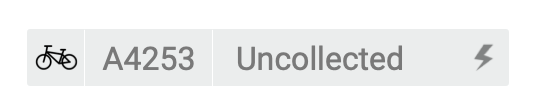
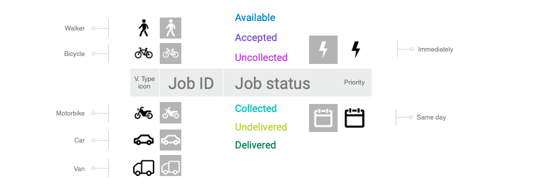
- Jobs have two distinct consecutive lifecycles: validity (jobs expire after 4h if not accepted) and delivery, and dispatchers need to know, at a glance, what stage a job is in;
- Dispatchers can transfer active or queued jobs between drivers but cannot perform actions (edit, delete, etc) after they're assigned.
- Jobs are dragged and dropped onto drivers and not the other way around (should have a fallback for unsupported browsers via action area). Once assigned they're no longer listed in the jobs queue.
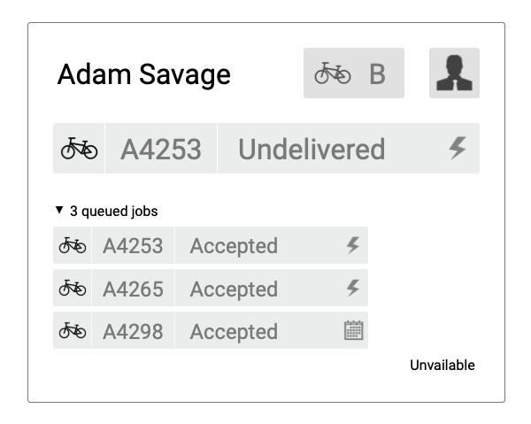
- Drivers have active and queued jobs, ideally only 1 active and everything else queued;
- Drivers need an availability status
- Time needs to be represented in elapsed time.
Below you'll find a breakdown of the patterns I worked on.
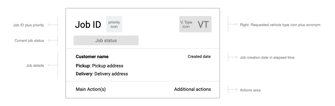
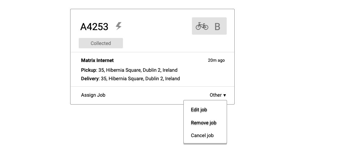
Concept Design
Cards: jobs
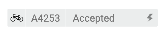
Job cards have 3 different sections: primary info, job details and actions.
The first two correspond to the critical and important buckets.
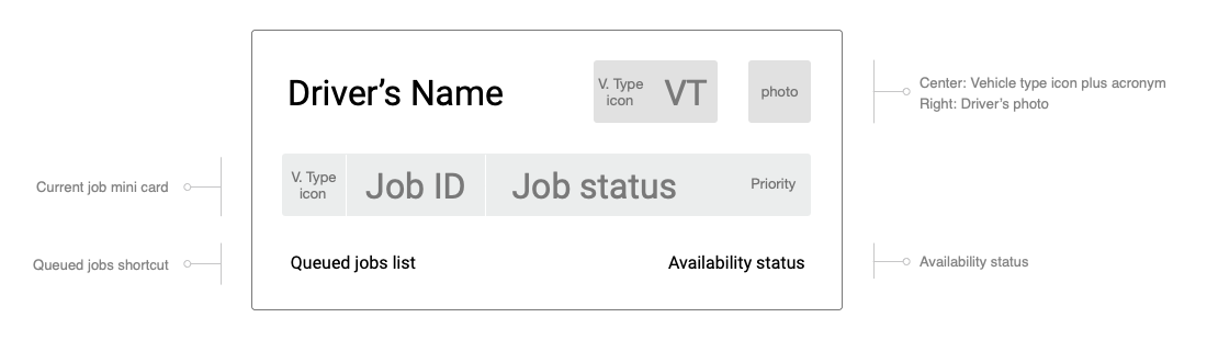
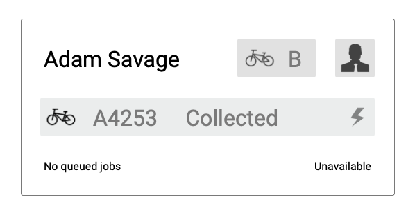
Concept Design
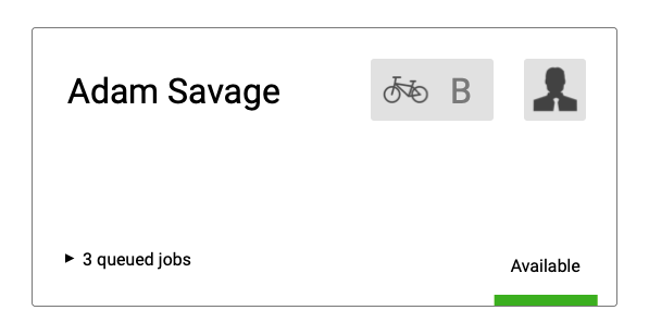
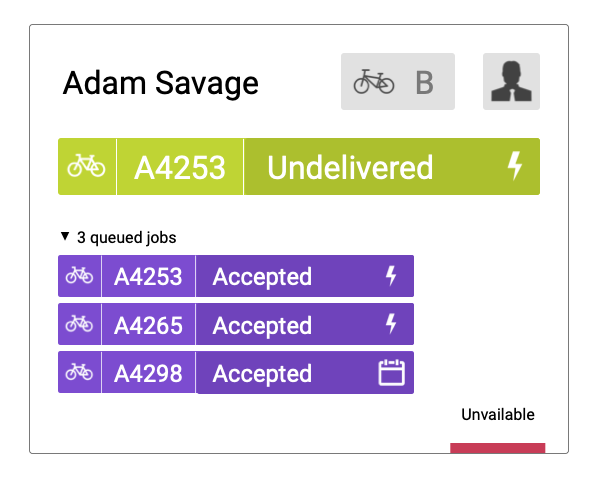
Cards: drivers
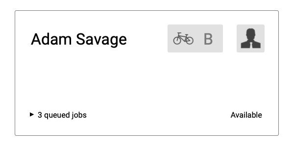
Driver cards are actionless and were created to be easily scannable.
Cards display the critical info on their default collapsed state and the important info (queued jobs) is shown on the expanded state.
Concept Design
Mini cards
Once dropped onto a driver card, job cards are minified because no action can now be performed on them and display only the critical information, which is the only relevant data once the job's assigned.
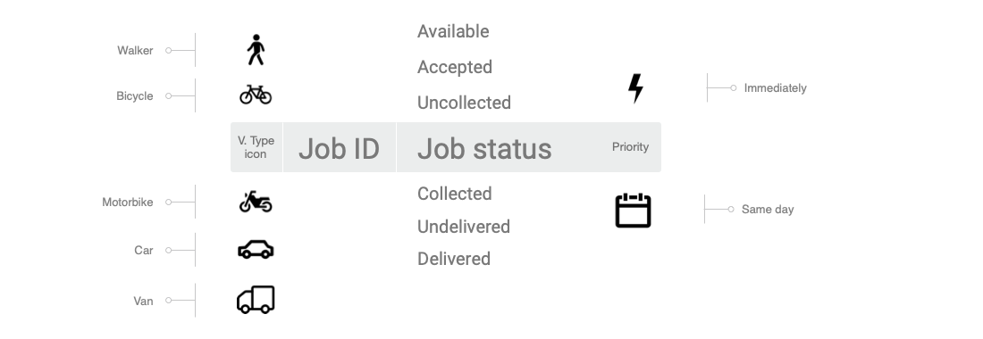
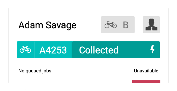
Similar to the job mini cards, driver cards also have a minified version that's included in the card of any active or queued jobs to identify the driver and vehicle type.


Concept Design
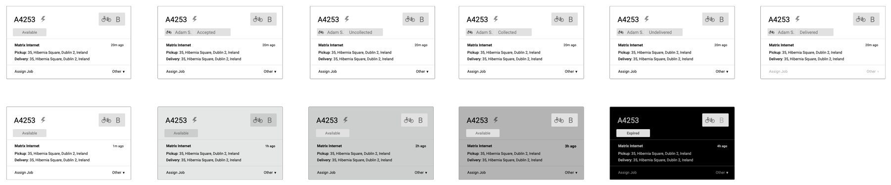
LIfe cycles of the job cards
Although they wouldn't be used in the context of this project (as assigned jobs become mini cards on their driver's card), I've created the entire delivery life cycle (top row) including driver mini cards, in case these would be used somewhere else, like another dashboard or view for example.
Bottom row shows the validity life cycle.
Concept Design
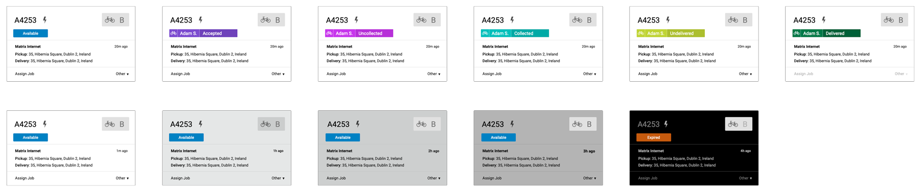
Cards: colour studies
Once the above elements were completed I started testing card clusters, which brought me to colour studies.
At this point I want to validate my assumption that I can mitigate cognitive load and avoid pattern blindness just by using color, which was confirmed later in ad-hoc user testing, and validate that using 2 color scales (blue to red + teal to green) would help minimize the "uncollected problem" (drivers will often accept a job but fail to collect the package), which was unclear in testing.
Concept Design
Documenting interactions
I've documented dragging and hovering behaviours, interactions with other objects and a few edge cases, besides core interactions like assign job to driver via drag & drop interaction you can see below.
First half shows the job card in its default state, then becoming translucid as it is dragged, then it forks between hovering drop zone 1 (active jobs) and drop zone 2 (queued jobs) as a mini card, and lastly the change (or not) of the driver's availability status after the card is dropped.
Second half shows the changes to the stats area depending on route taken.
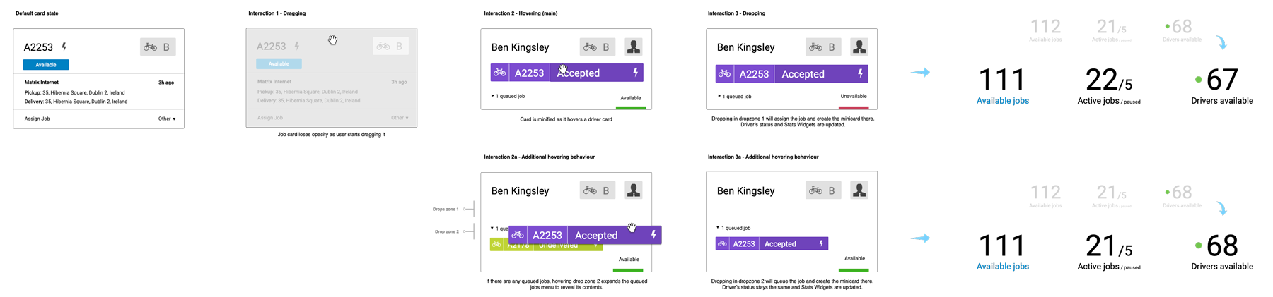
Documenting in this fashion is somewhat laborious but reduces dramatically the number of errors and misinterpretations. If I'm documenting for developers, I try to meet the team before starting any work to determine what works for them. I always tailor my docs according to my audience.
Concept Design
The dispatch screen
The dispatch screen is divided in 3 main areas: stats, cards and map.
Stats give a clear snapshot of the current operational situation. Widgets are divided between jobs and drivers. Some have a breakdown of the total number into its parts or an average (see small text beneath totals).
Cards are divided into jobs and drivers columns. There are sort and filter tools at the top. The map displays these drivers and jobs contextually.
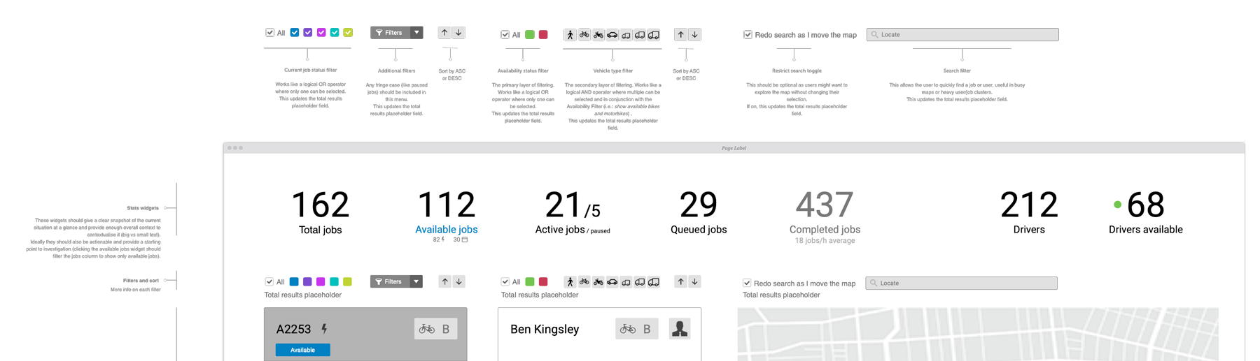
Above: detail of the dispatch screen doc page
The Job and Driver columns scroll independently and the Map only occupies the vertical height available in the viewport.
Job cards are sorted by priority first (immediate delivery followed by same day delivery) and then by status (from available to undelivered; delivered jobs are not displayed).
Except for any available job in the risk of expiring, which is pushed to the top of the list no matter its priority.
Driver cards are sorted by availability first, then for estimated time to full availability (if a driver’s job status is undelivered s/he’ll be free faster than a driver whose job status is uncollected) and lastly by number of queued jobs.
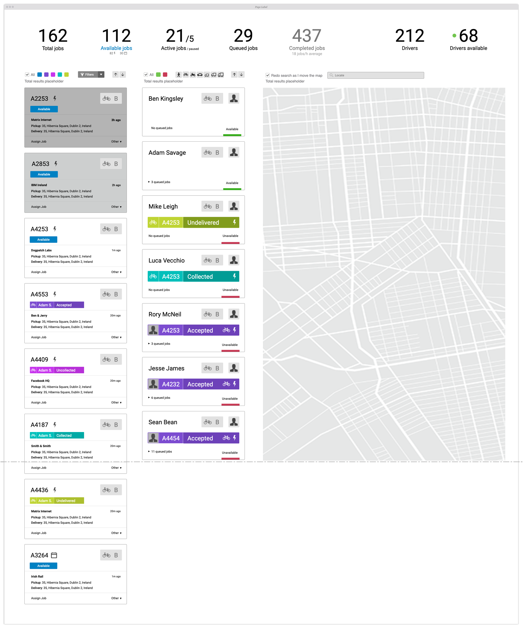
Above: dispatch screen doc page showing the fold cutoff
Concept Design
Prototype
Tying it all together
Please note that due to time constraints, stats are static, there are no markers or routes on the map except for motorcycles (at 00:37s in the video) although the map zooms and pans like they are there.
The primary purpose of the prototype is to answer the question "does it all come together and work?" and for that I conducted a series of unstructured tests and determined that:
- The concept is solid and easily understood even for non dispatchers.
- Cards are easy to scan, the color coded availability greatly simplifies driver assessment; and the drag & drop and card interactions work really well.
- The job status colour scheme isn't as straightforward as the availability, for example, but all testers suggested that it would "feel like second nature after a couple of days".
- Dispatchers often want to give preferencial treatment to certain customers — something I clearly failed to identify during research — and it wasn't as easy as expected to scan that information here.
- As expected, filters and sorting tools would need to be complemented with presets, combinations and search to suit large operations.
Outcomes
Although it was originally estimated as a 1 week project, this was concluded in just 3 days: 1 day for discovery and ideation, 1 day for concept design, and 1 day for the prototype.
It was enthusiastically welcomed as it surpassed expectations ten fold. The most immediate reaction was halting and rewriting a promotional video Zoom was shooting to include the dispatch screen (much to my panic as the prototype was so unpolished and rough around the edges) and shortly after the entire Product roadmap was restructured to prioritise the dispatch screen pushing everything else back.
For me it's always gratifying to deliver high quality work and go above and beyond in less time than expected.