Digitise a cake order process and design an application consistent with the kiosk platform
- Role UX Designer
- Duration 3 days
- Team Sole Designer
- Deliverables Clickable mid-fidelity prototype, flows, specs
Discovery
Overview
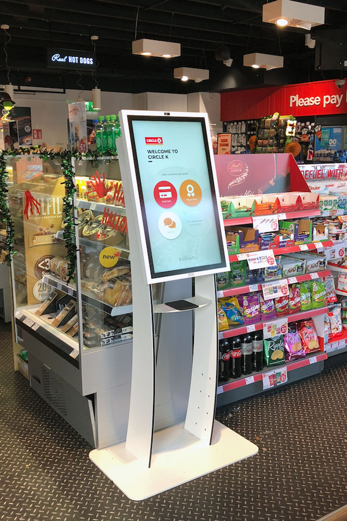
Intouch.com helps physical retailers use IoT to personalise customer experiences, improve operational efficiency and empower staff.
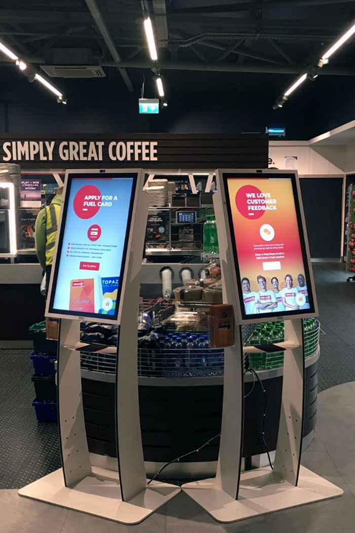
In early 2018 they had just successfully implemented the digitisation of a large retailer’s loyalty programme and were testing new ways to use the in-store kiosks to bring more value either by improving existing processes or by creating new opportunities for revenue.
This was the first independent app (i.e. not related with loyalty) they wanted to test.
Problem
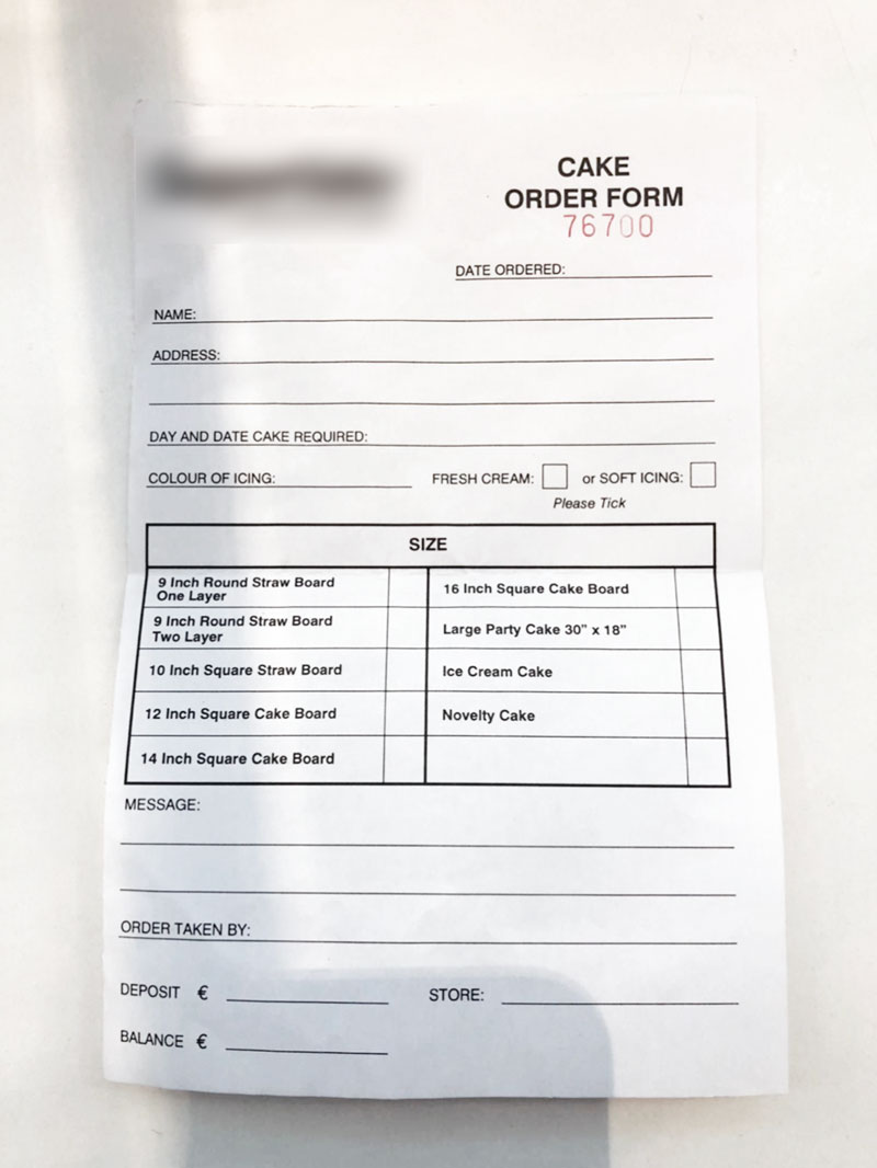
The cake ordering process at LargeRetailer’s bakeries is entirely analog: a staff member fills a paper slip (image 1) while conducting a series of questions to the customer, receives (partial) payment from them and then internally re-sorts all existing cake orders based on delivery date, urgency and other parameters.
Solution
Using the in-store kiosks to order cake will allow customers to check prices, explore multiple size and decoration options without burdening staff, enabling them to easily order cake from one of the multiple in-store kiosks.
This will also allow to fully automate the queue, alerts, reports, etc and creates more monetisation opportunities by upselling, bundling with other products, integrating with the loyalty program, etc., not to mention increasing productivity just by time saved alone.
Discovery
Field Study
As there was no data characterising users nor defining their needs, I visited a few stores where I could observe customers ordering cakes.
I was interested in finding out if there was a particular demographic, event or theme that would stand out from the rest, so that I could focus a bit more on them.
I was also particularly interested in the interaction between customer and staff to determine:
- What is their approach, if any, to the order?
Do they start by type of cake, number of servings, theme (birthday, etc), special needs (allergies, etc), urgency (time based), etc, and where to they go from there? - Is there any data that doesn’t get registered because it is implicit?
E.g., any information that all bakers know so therefore doesn’t need to be registered. - Similarly, what implied constraints influence an order?
E.g., cake type X never gets frosting type Y, cakes size Z need a minimum of x days to bake, etc.
Research revealed multiple constraints that would need to be baked (pun intended) into the ordering logic but had little effect in the UI or flows and therefore the agreement with the client was to disregard them for the time being.
Discovery
Contextual inquiry
Although I wasn’t able to observe many people in my field study, that gave me enough data to tailor more effectively my contextual inquiry questions, which I did while ordering cake for myself (something I definitely classified as a win-win situation).
I ended up identifying some of the bakers' pain points alongside with the customers' and made a note for future use, if needed.
After ordering 2 cakes, observing 4 customers, and speaking with 5 different bakers, I had a clear idea of what the digitised process should look like.
Discovery
Flows
Based on my observations and interviews, my initial task flow contemplated 2 routes:
- Build your own, where users customise everything
- Pre-made cake, where users start off from an existing cake and customise only a few aspects (size, message, etc).
This was later removed from the prototype at the client’s request.
At this stage it was still unclear if the app would be able to simplify the ordering process by pre-populating the form with customer data, so I mapped the flows without it.
Concept Design
Sketches
Using the UI/UX patterns collected during Discovery as examples, I quickly sketched some key screens in order to in/validate some assumptions.
I've learned that:
- Due to the constraints, the digitised cake ordering experience would have to be a cumulative process, i.e., users build their cake step-by-step;
- users would need to be able to change most, if not all, settings, at any time, without losing their progress;
- displaying overall progress would anchor the experience in case no customer data could be pre-populated, resulting in 4 additional steps/screens.
With this out of the way, I moved on to create a quick POC.
Concept Design
Proof of Concept
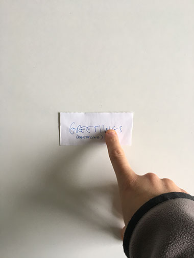
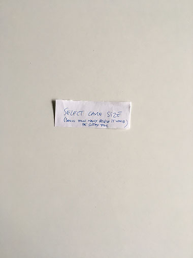
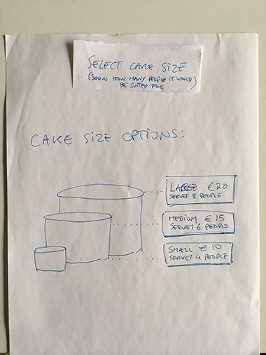
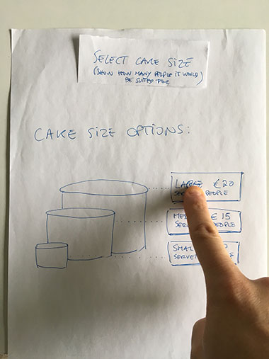
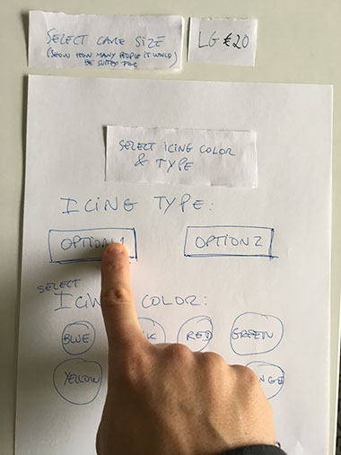
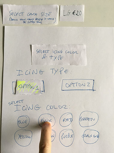
Using pen, paper, and scissors, I quickly built a few simple patterns and arranged them together, taking photos of each one of the steps and interactions.
I then combined all those photos into a PDF document (for manual step-by-step progression) and an animated gif (for automatic play) and sent the proof of concept to the client for approval.
Above: several images from the PoC.
Detailed Design
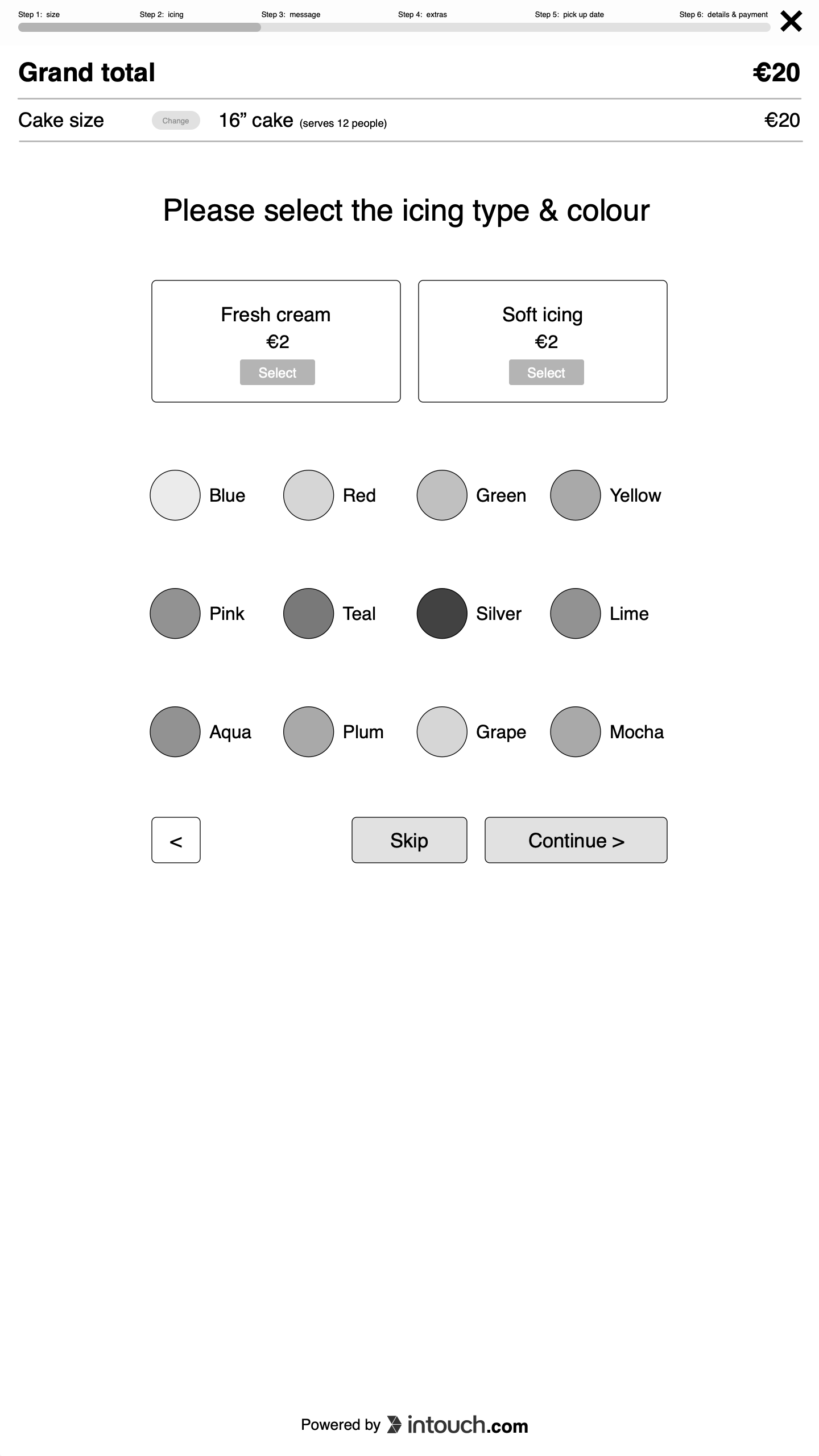
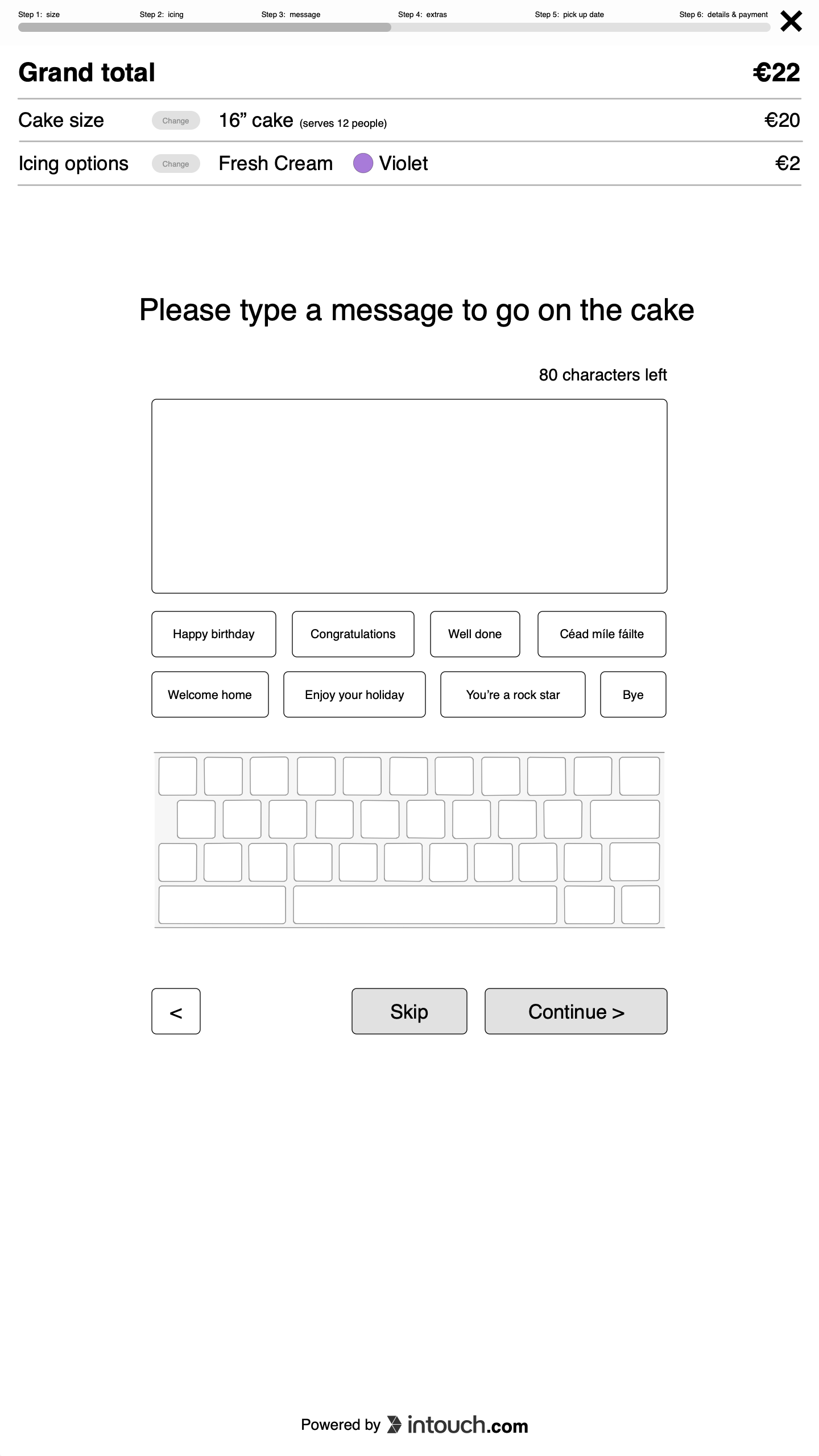
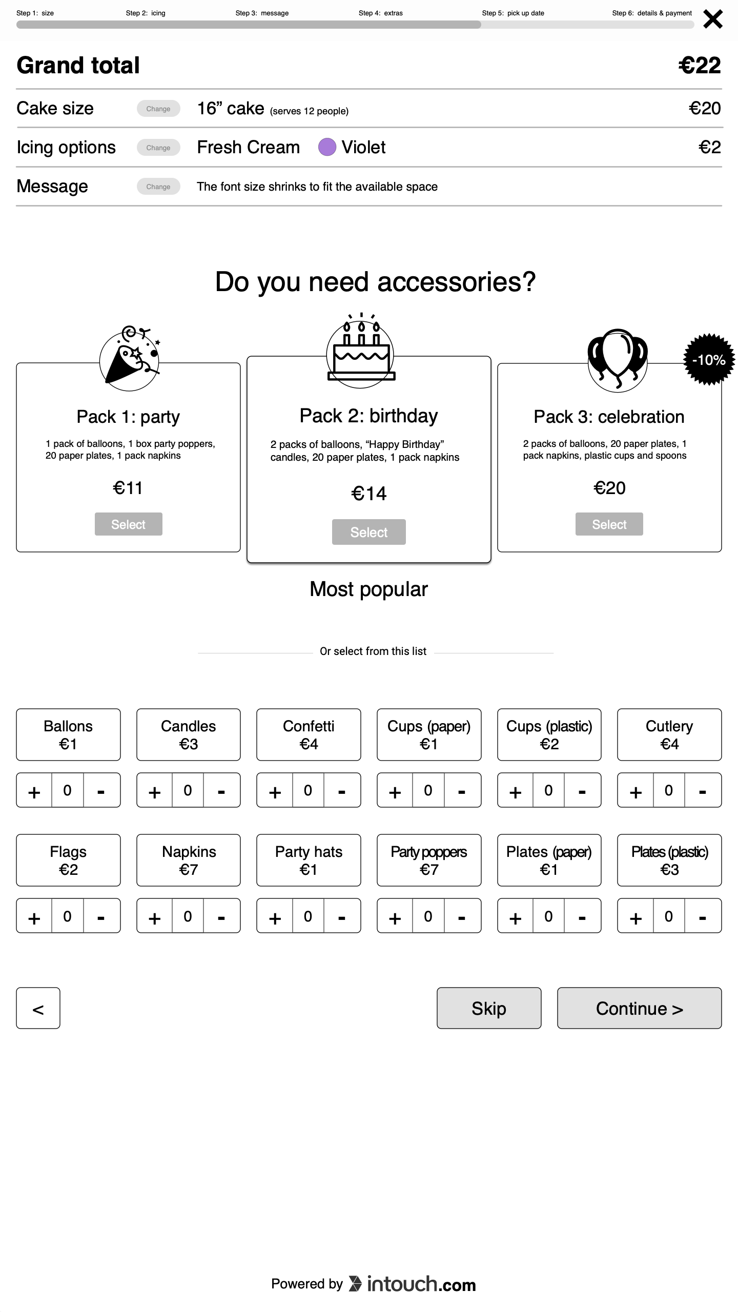
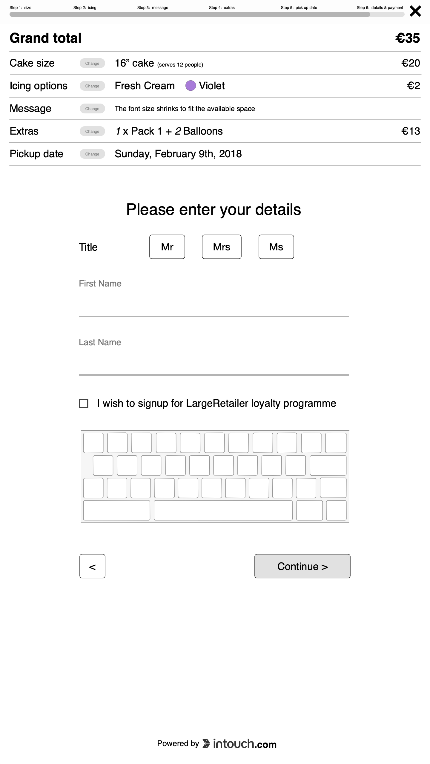
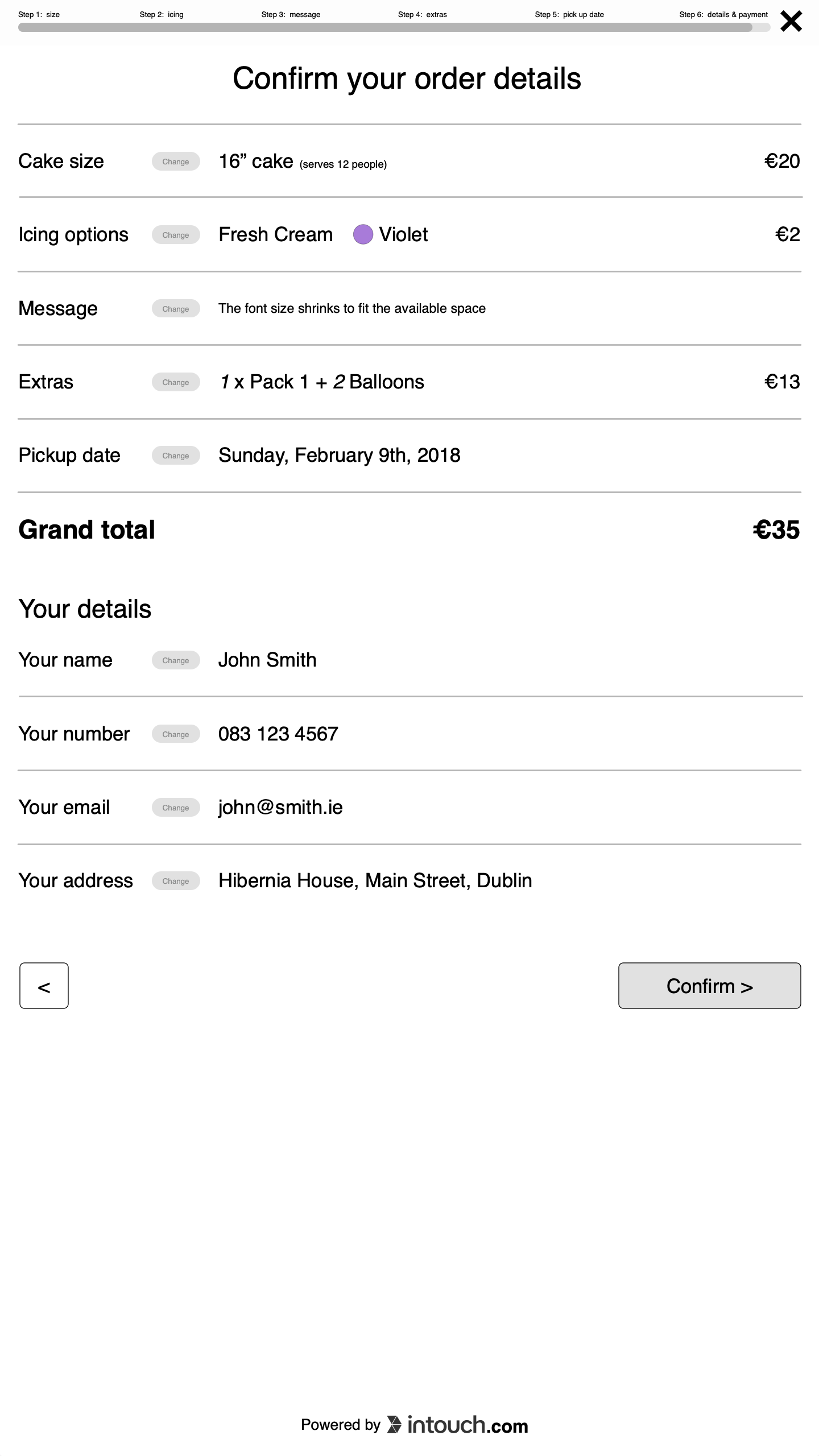
Upon approval of the proof of concept, I spent a day building the application screens and clickable prototype.
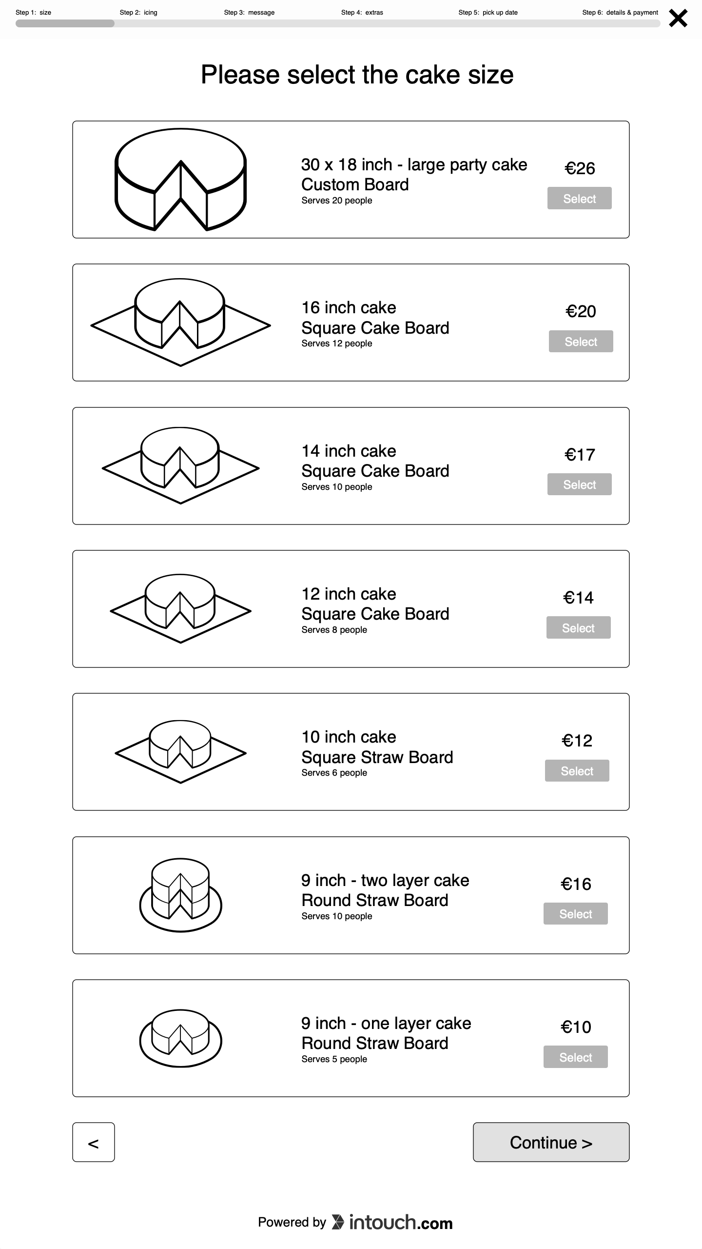
Although it wasn’t part of the original brief, I reverse-engineered the kiosk’s aspect ratio + HTML & CSS style into a proportional grid and type scale in OmniGraffle, to mimic as close as possible the existing patterns and style.
This means the prototype could be tested directly in the kiosk and if it ever went to production, would have a direct correspondence with their existing patterns.
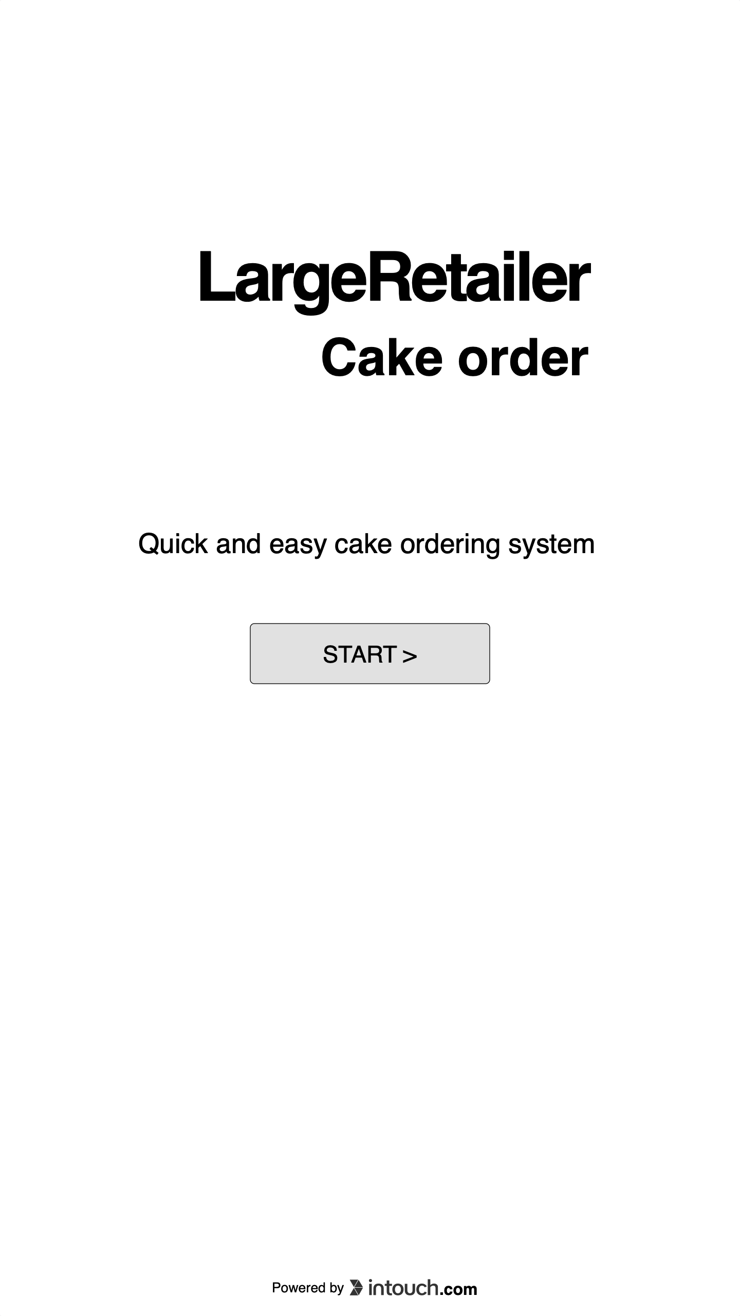
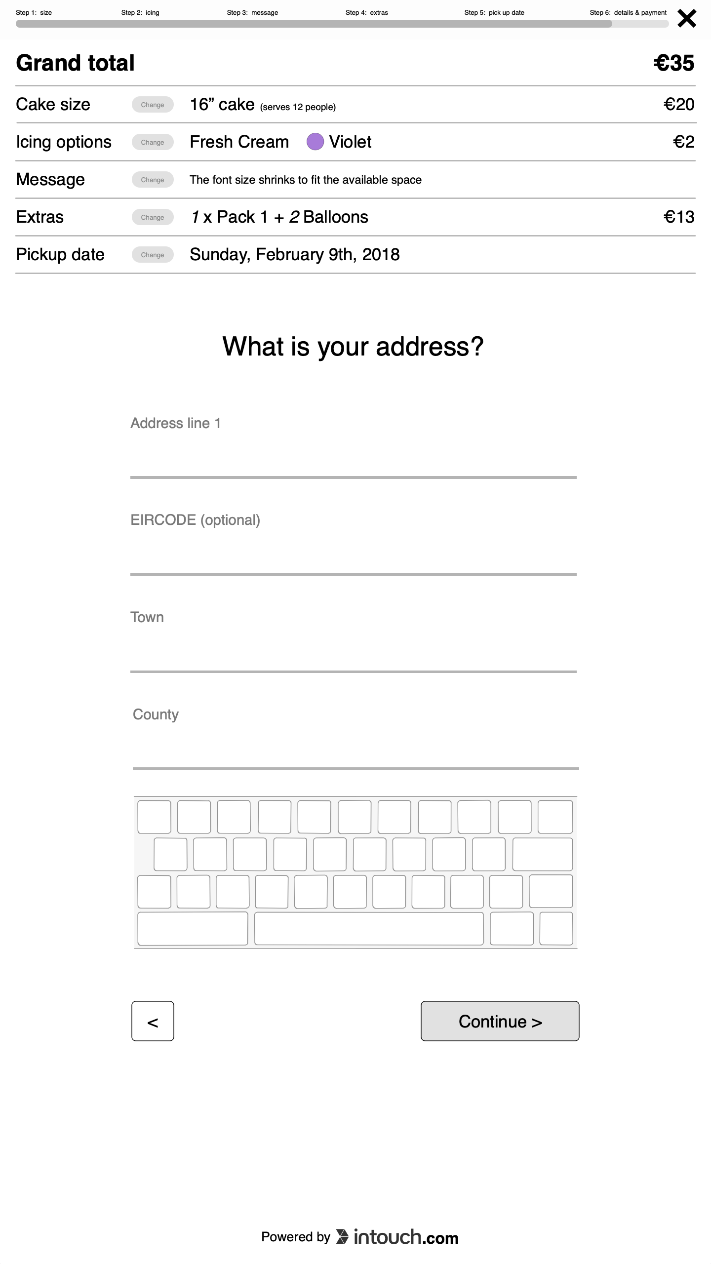
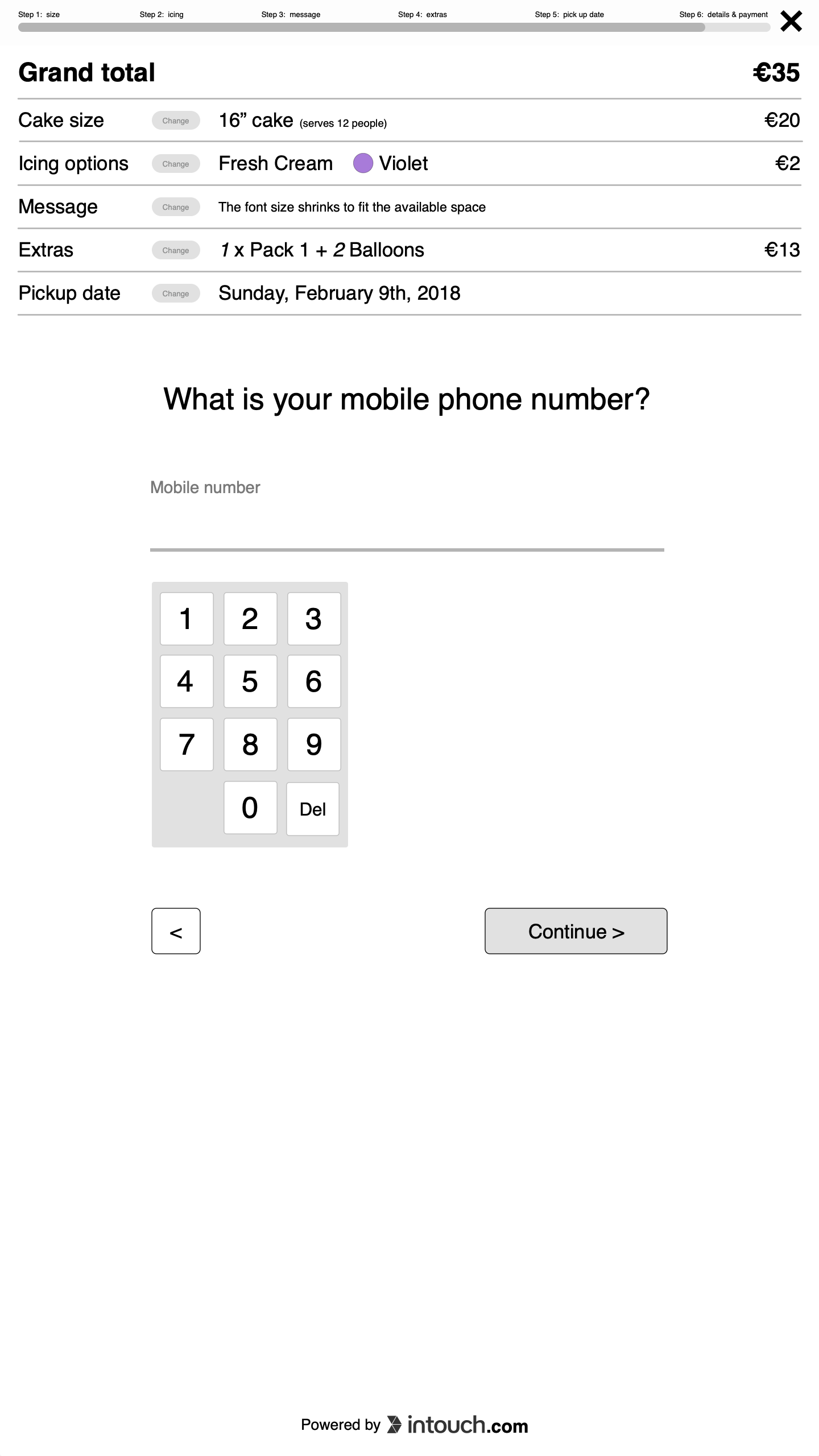
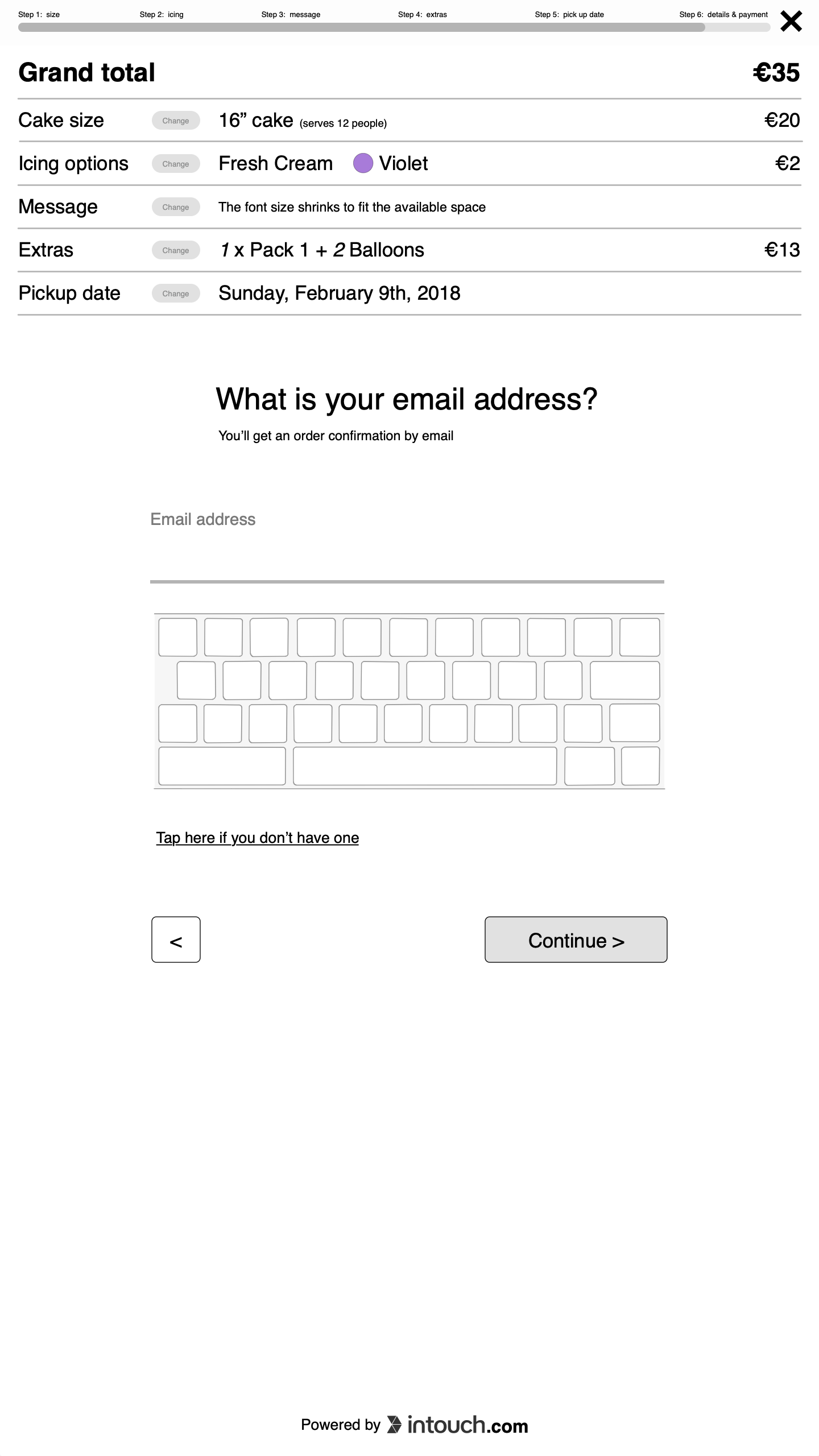
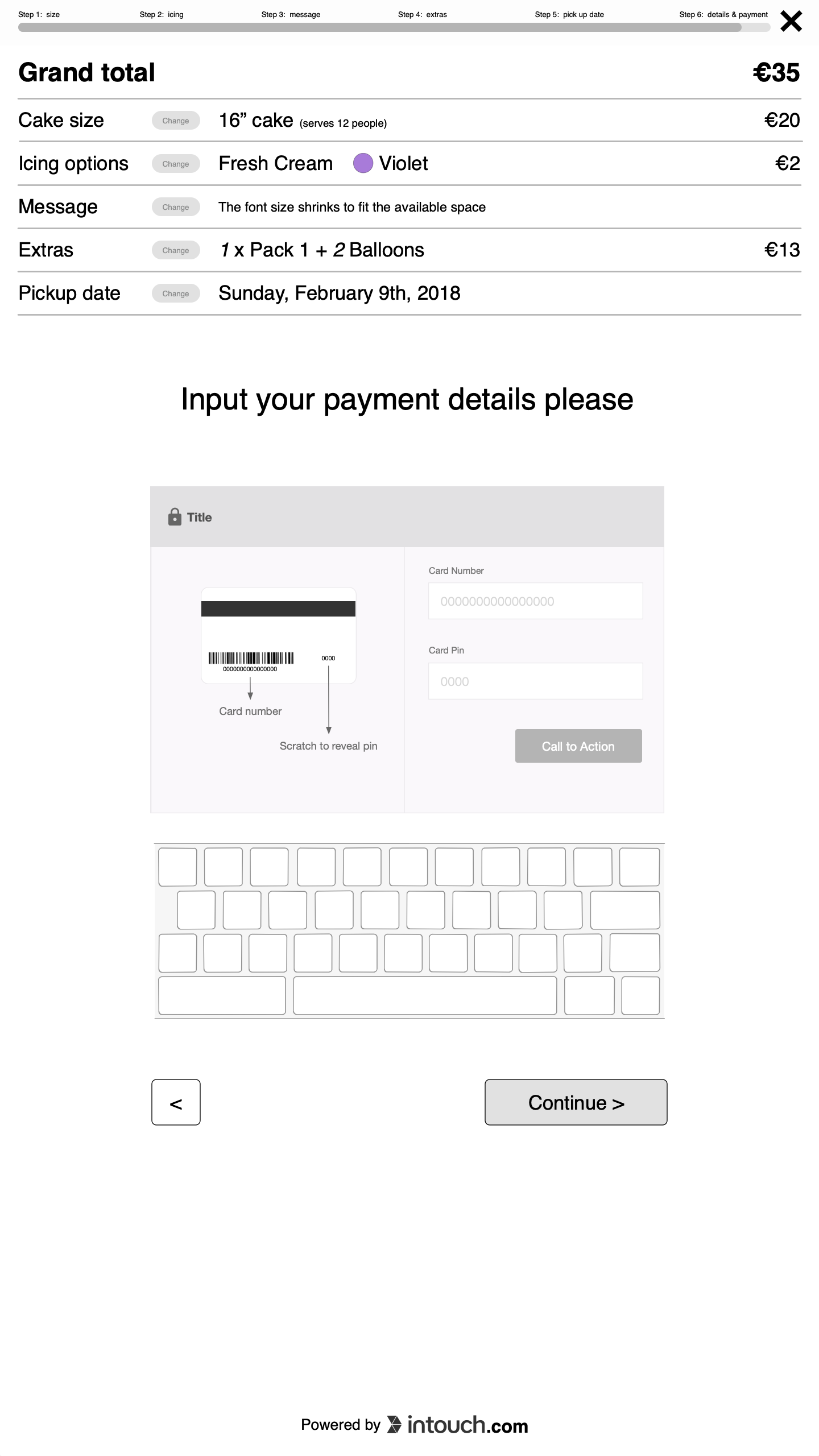
Below: mid-fidelity screens from the clickable prototype
Outcomes
Although originally estimated as a 1 week project, this was concluded in just 3 days: 1 day for discovery and ideation, 1 day for detailed design and prototype, and 1 day for minor fixes and documentation.
My client was able to pitch this earlier than expected, effortlessly test this in the in-store kiosks and due to its low tech nature, socialise the prototype with other stakeholders outside Dublin and Ireland.
For me it’s extremely rewarding being able to provide more value in less time and it’s always a humbling experience to do it in such a low tech way despite the many thousands of Euro worth of software and hardware at my availability.
