Personas and User Journeys deep dive
- Role UX Designer
- Duration 4 days
- Team Sole Designer
- Deliverables Personas, user journeys, audit reports
Discovery
Overview
Offr.io The world’s first collaborative end-to-end property transaction platform.
In July 2018 I was asked to do a UX audit to their platform as they were getting ready to test their MVP with some users. This lead to a deep dive into personas and user journeys to understand their pain points, motivations and needs as they go through the property sale process.
Problem
Buying a house is painful. It's also hard work for everyone involved: at least 1 buyer, 1 seller, their solicitors and 1 real estate agent in a process without regular communication and updates between parties regarding the current status of the process. This leads to a lot of frustration and distrust.
Solution
In a nutshell, a platform where the property sale process is fully automated and users are prompted to contribute the right thing at the right time. Still, for it to provide a user experience that matches the benefits of the improved process, it must take into account the motivations, pain points, and frustrations of its users at every step of the property sale process.
Discovery
Interviews
Robert Hoban, the CEO and founder, has worked in the Irish property sector for over 16 years, specialising in the sale of commercial and residential assets.
He's largely responsible for the design of BidX1's online auction platform, which provided transparency, speed and maximum efficiency to vendors and purchasers, all but eliminating the existing nightmarish process when it comes to submitting offers, signing contracts and paying deposits.
As I had no knowledge of the property market, this was a free form interview that quickly became a workshop.
Discovery
Personas
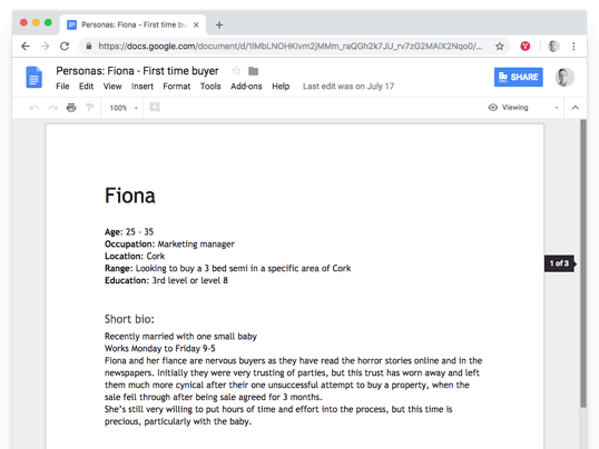
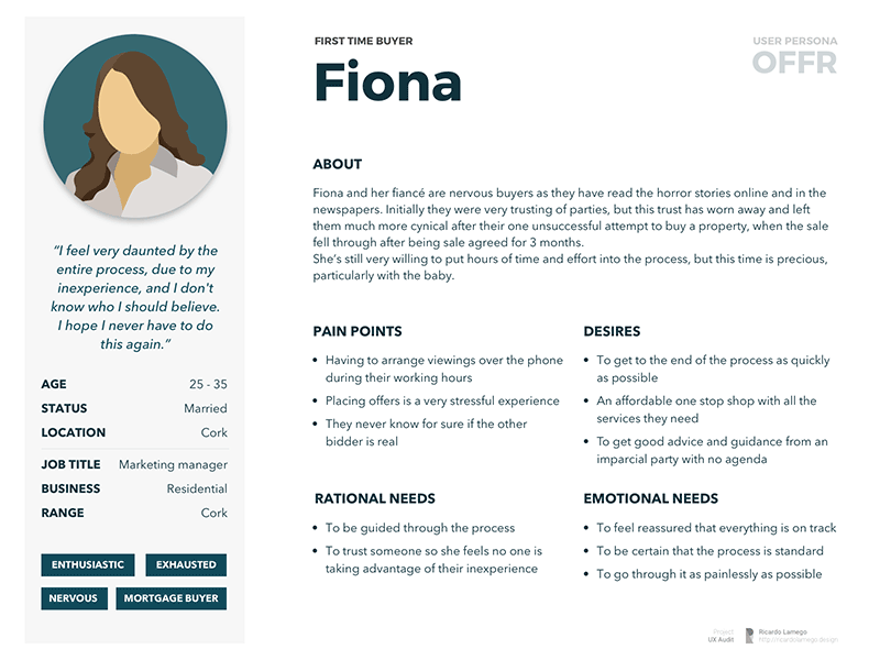
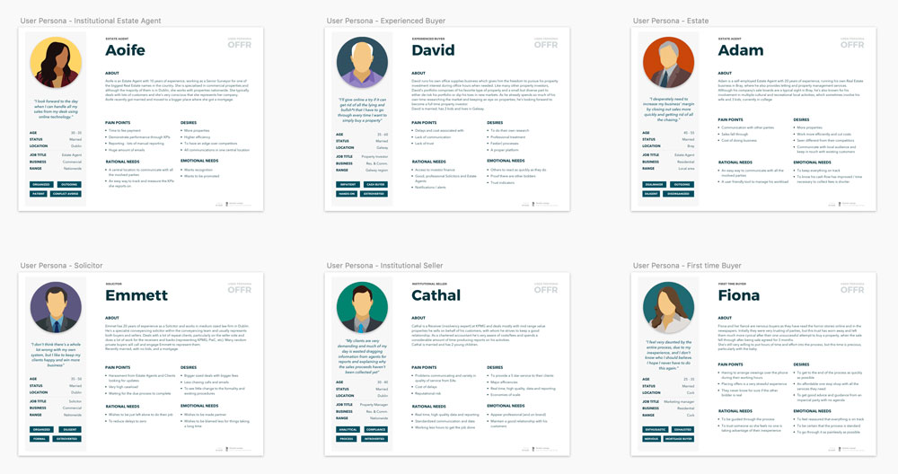
We developed 6 personas: a solicitor, an institutional seller, a first time buyer, an experienced buyer, and 2 estate agents that represented the old school vs new school approach you see on the market.
As Robert was extremely knowledgeable, I used a larger framework to capture nuances like emotional needs vs rational needs, pain points vs frustrations, etc and to capture additional information like trigger words, something that a content strategist will use later to create copy.
I encouraged Robert to use these as living documents he could share with anyone joining his company and update as they grow but produced a synthesized, more polished, version he could also socialise externally.
To minimise bias I avoid using photos of real people and regularly use these faceless, emotionless illustrations that I can further customise to increase gender/age/ethnicity/etc diversity.
Discovery
Flows
As the only thing that remains constant throughout the entire sale process is the property itself, we made it the focal point and built the flows around it.
This made it easier to approach them as task flows, which was more inline with what Offr was trying to build, and a few patterns and caveats became immediately clear as we were doing it.
We also mapped how Offr had implemented these processes into their platform to later use in the audit.
The entire flow captured in 2 panorama shots.
Discovery
Whiteboarding
Now that I understand the users and process, I gradually shift my focus towards their technical solution.
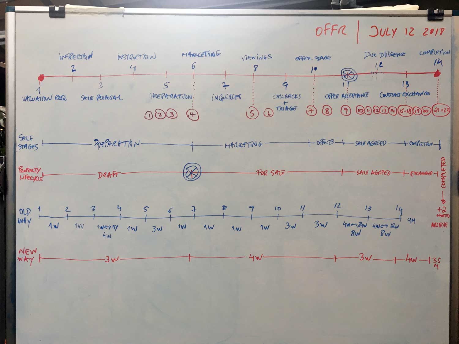
We took the flows and created a timeline that combined the sale stages with the property life cycle, onto which we overlaid the activities and estimated time to complete.
A few patterns emerged, being the most important that the majority of the tasks on the platform were at the last stages and they weren't covering all the ground.
From there we started mapping the user journeys, first as collective to see all the touch points and how one's actions affected the rest, and then individually as we started to explore problems and opportunities within each persona's journey.
It's during this process that we became aware of other significant aspects, like for example that buyers have 2 distinct journeys, one as bidder followed by one as buyer, and that they should be treated and handled differently, in particular regarding the risk of gazumping still lingering over accepted offers.
Discovery
User Journeys
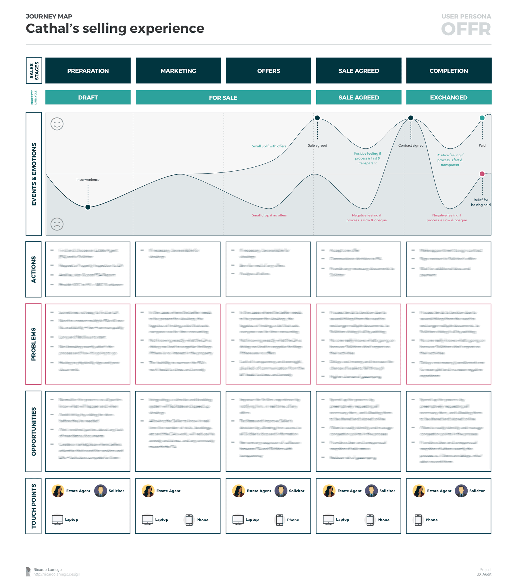
The last part of the user journeys work was to put it all together in an individual map: events, actions, problems, and their corresponding emotional effect plus all the opportunities, business and otherwise, we've identified along the way.
This is when the value of user journeys became crystal clear: from simple recommendations to adjust the voice and tone of system messages, to uncovering massive opportunities to innovate and disrupt an entire industry.
Outcomes
More than a list of things to fix, Offr was able to identify multiple points where they would need to focus to ensure a consistent user experience.
We also uncovered multiple ways to improve their current process as well as unlocked multiple opportunities to innovate and disrupt their market.
Depending on their growth rate, that alone might feed their roadmap over the next few years.
For me, helping an organisation become more user centric is already reward enough.
