Design an activities mobile app for parents and educators
- Role UX Designer
- Duration Undetermined
- Team Sole Designer
- Deliverables Wireframes, Specs, Website
Discovery
Project Details
MiudosSegurosNa.Net (it stands for KidsSafeOnThe.Net) is Portugal's pioneering and leading Internet safety project. It helps Portuguese speaking families, schools and communities in promoting online safety of kids, tweens and teens since 2003.
In late 2017, after a particularly difficult summer for parents and educators, we began working on this project and research results lead us to create an app.
Problem
Reports that their teenage kids spent summer indoors, online on their mobile device night and day, are growing every year. Whereas 20 years ago kids would spend a large amount of time outdoors playing with friends, doing sports, etc, nowadays they spend all their time glued to an electronic device. Even during family time, weekends and summer holidays, parents and educators struggle to find activities appropriate for their kids' age and minimize screen time.
Solution
Create a database of kid friendly activities, classified by age, location, requirements and constraints, where parents and educators can search for activities that fit their particular needs.
Discovery
Requirements gathering
Tito de Morais, founder of the project, already had collected a wealth of data from his numerous workshops, talks and media appearences, plus everything else he flagged on the various social media channels and newsletters, with roughly 40,000 followers/subscribers by late 2017.
We parked business requirements for the time being as
our focus at this stage is on user requirements and any possible technical requirements we can infer from the data.
We've identified the following:
- Target users range from 25 to 50. Older people are generally better at this.
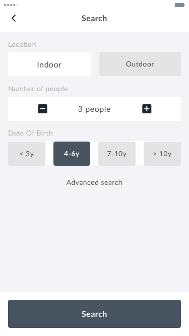
- Users want to filter indoor vs outdoor activities, individual vs group, age range, activities that require devices, and activities that require adult supervision.
- Although their main use case was during long school breaks, most said there was no reason to use regularly on weekends for example.
- Surprisingly (or not) the majority of people favoured an app vs an online experience.
- The two main user needs are: find an activity the kid(s) can perform on their own and find an activity I can perform with the kids.
Concept Design
Sketches & Wireframes
There were 2 rounds of tests with initial sketches and later with the wireframes.
Results revealed that:
- Users want to save data* but don't want accounts
- Users might want to have their kids using the app unsupervised
- Users don't want lists of results, just a couple of suggestions
- Users want primarily to filter indoor vs outdoor activities, individual vs group, and age range. Then, if necessary, activities that require devices and activities that require adult supervision.
* users want to save activities (like favourites), search criteria and supply lists.
This had multiple implications over the initial requirements which were rewritten to take them into consideration.
Detailed Design
Detailed Design
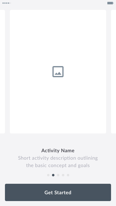
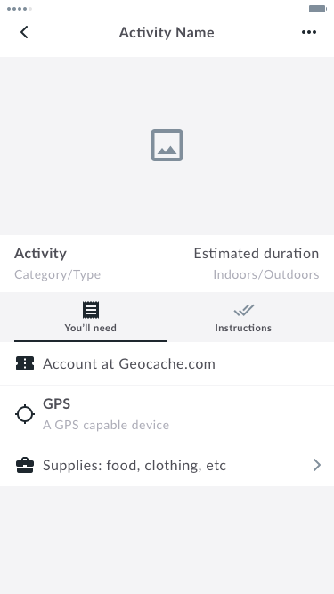
The app is still in development and this is the design we are currently testing.
Below you can see summarised representation of the main flow and a quick prototype.


