Build a Scalable UI: a product redesign
- Role Principal UX Architect
- Duration Indeterminate
- Team Junior UI Designer
- Deliverables Specs, prototypes
Discovery
Overview
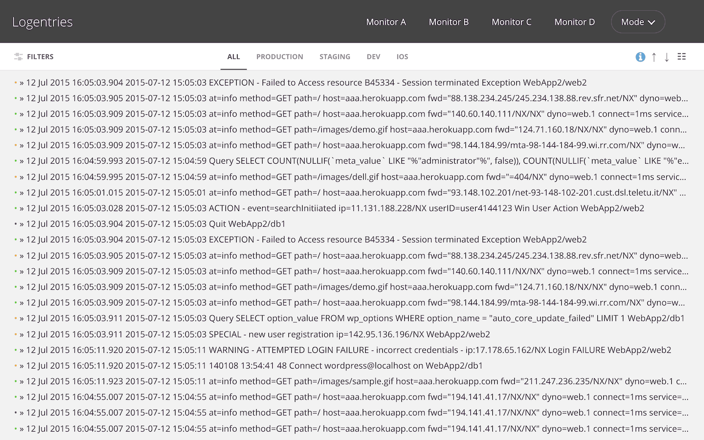
Logentries is a log management & real-time analytics SaaS company. In 2015, they decided to take a completely different course from the previous 5 years and bet on UX as the main key differentiator to create a competitive advantage. They hired me to do it and gave me a mandate to build a UX team capable of changing the product inside out.
A couple of months after I joined Logentries, the VP of Product assigned me this project which was, in a nutshell,
a redesign of the main app view where customers spend +95% of their time.
It was one of the many concurrent projects I was leading and always last on my ever-changing priority list.
On average our 2 people team would spend 4 hours per week working on it.
What made this project particularly interesting was learning how our users were actually using the product and uncovering many of their (unmet) user needs.
Problem
Logentries' customers range from the solo developer with a couple of environments, servers and apps, to companies as big as IBM or Microsoft for example with dozens of users, hundreds of environments and apps and thousands of servers.
For the former, the interface will be mostly empty in Log Groups (orange) and Log Sets/Logs (red), and for the latter there are so many items in Log Groups and Log Sets/Logs that is barely possible to find what you are looking for. Both experience the log lines bleeding off screen (yellow).
There's a sweet spot in terms of infrastructure, number of logs, chosen way to log data, etc, where it would be easy and comfortable for customers to use the interface. Anything before or past that point will have different levels of added difficulty.

Solution
To create a UI that adapts to the user's unique case, providing just enough filtering/sorting abilities for the size and complexity of their infrastructure, that prioritises the display of log data.
Discovery
Understanding the problem
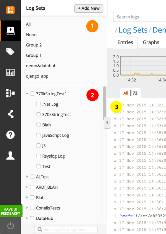
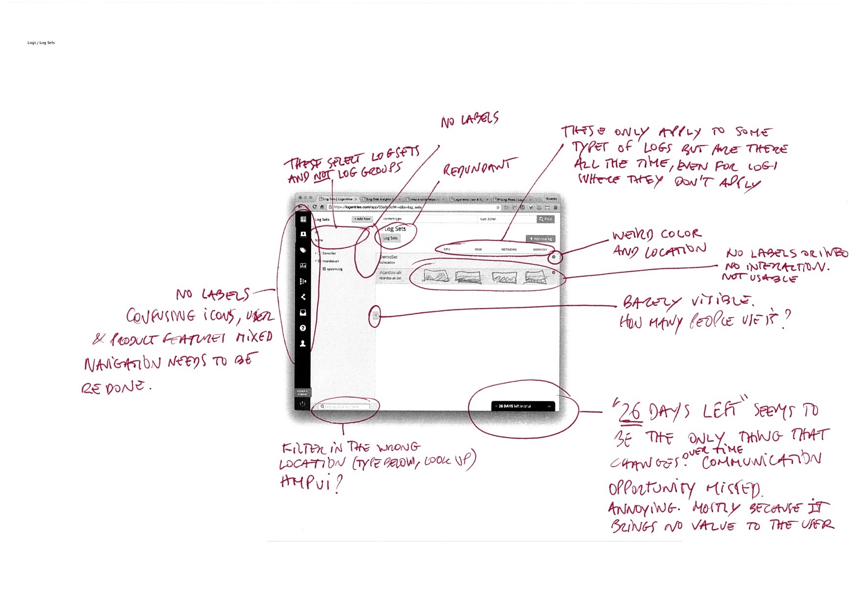
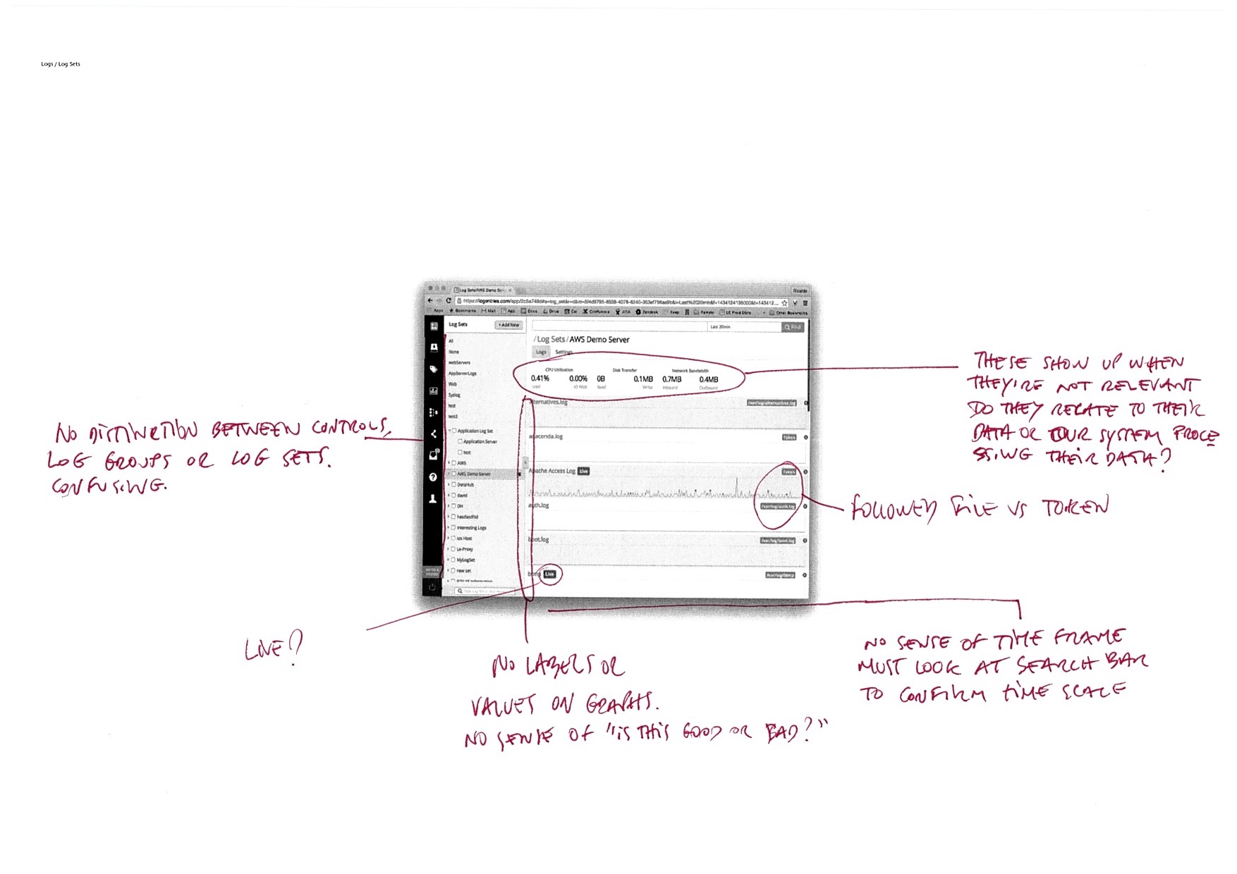
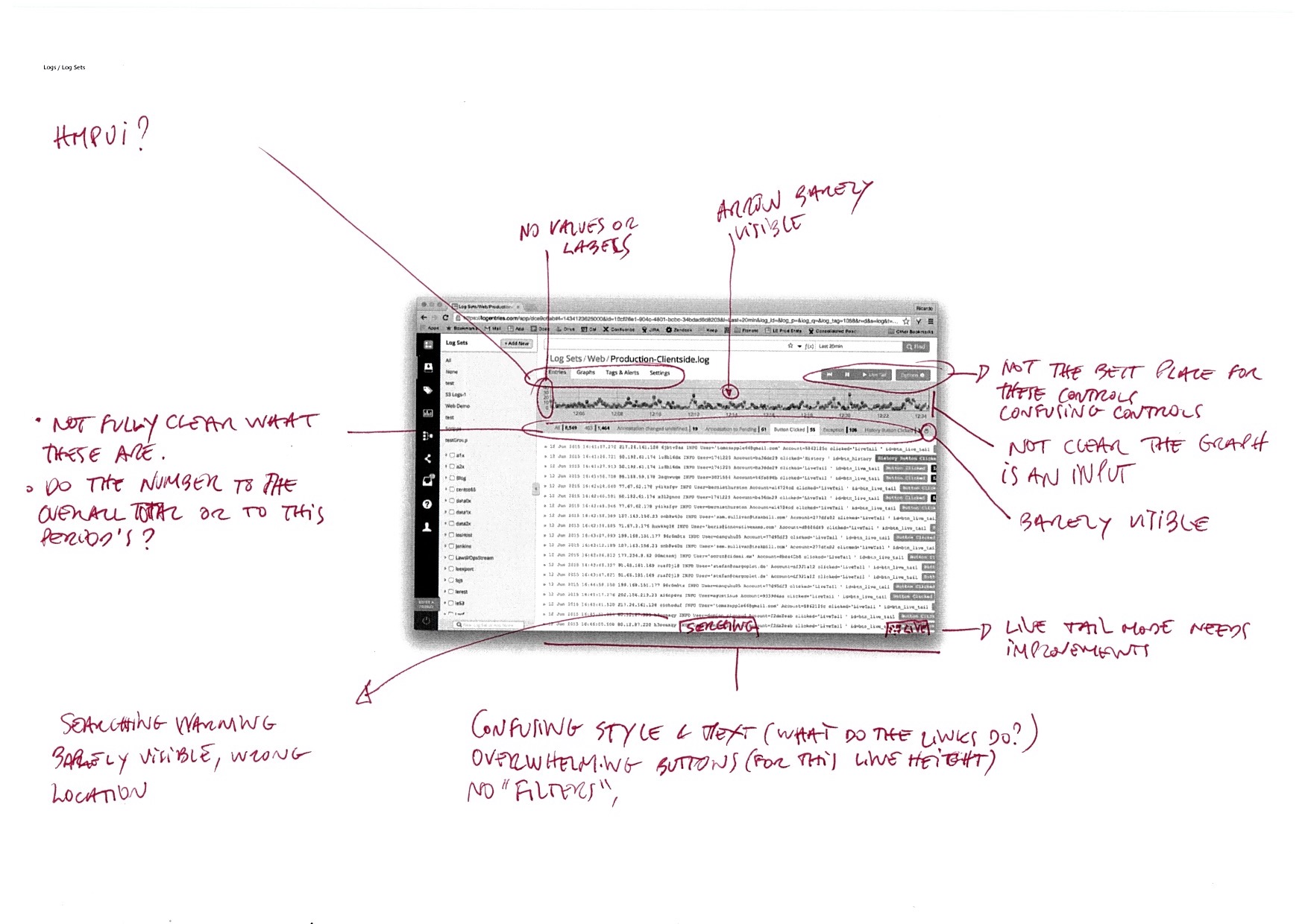
What are these and what do they do?
-
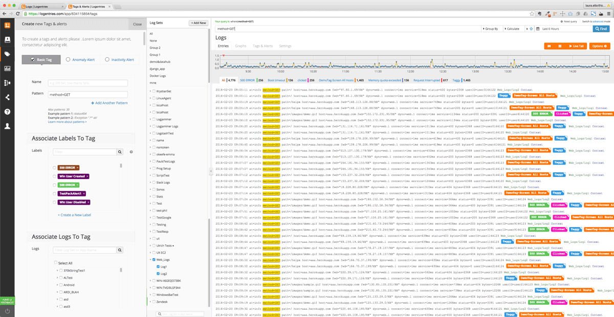
Log Groups
These are shortcuts (like bookmarks) to a single log or a combination of logs or hosts and logs. Their creation is done out of context so many users would not use them leaving this area permanently empty.
The first 2 items (All, None) are filters that look like the shortcuts and the title and button above it (+ Add New) adds content to the Log Sets area. -
Log Sets / Logs
Depending on infrastructure and how users log data, this list could be several pages long and/or up to 3 levels deep (host > app > log) making it very difficult to select logs wherein to search for data.
-
Log Entries
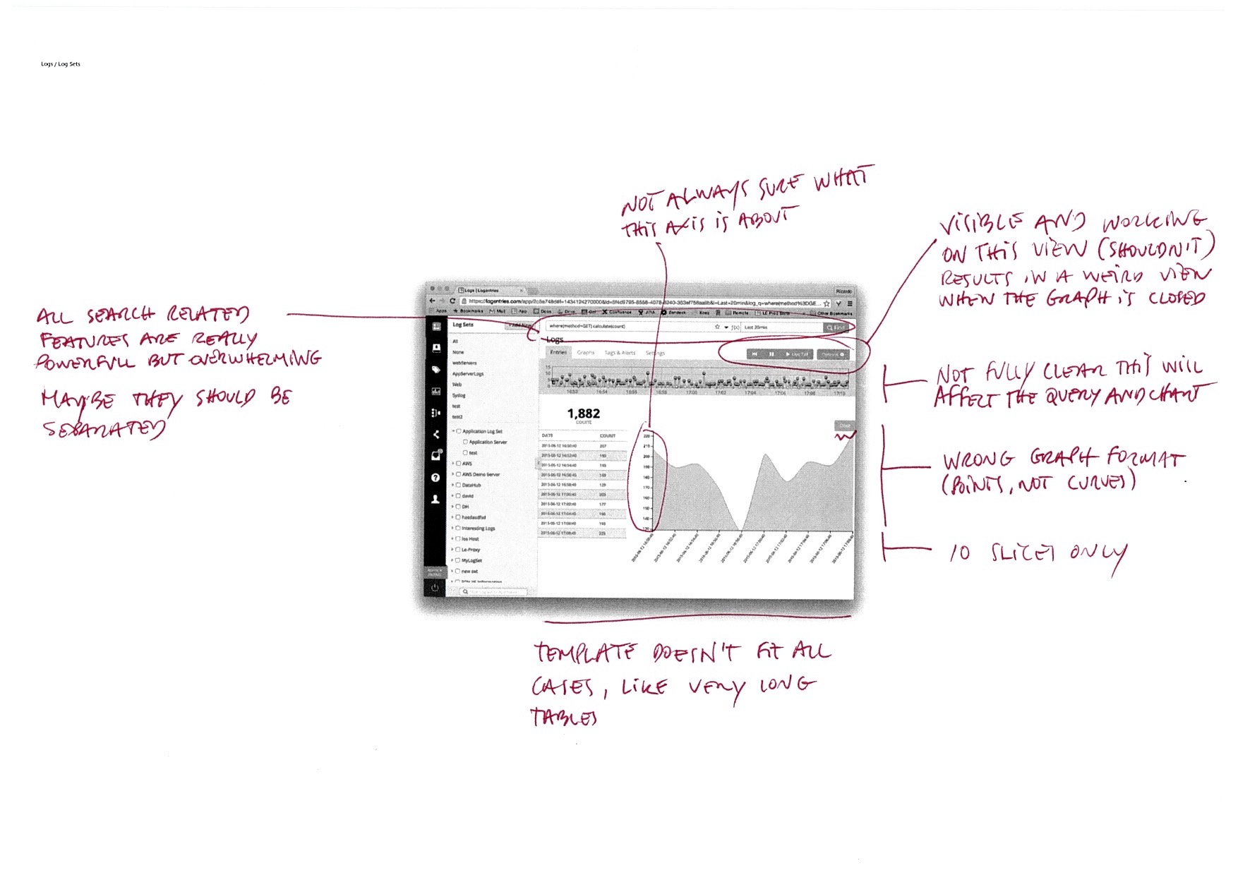
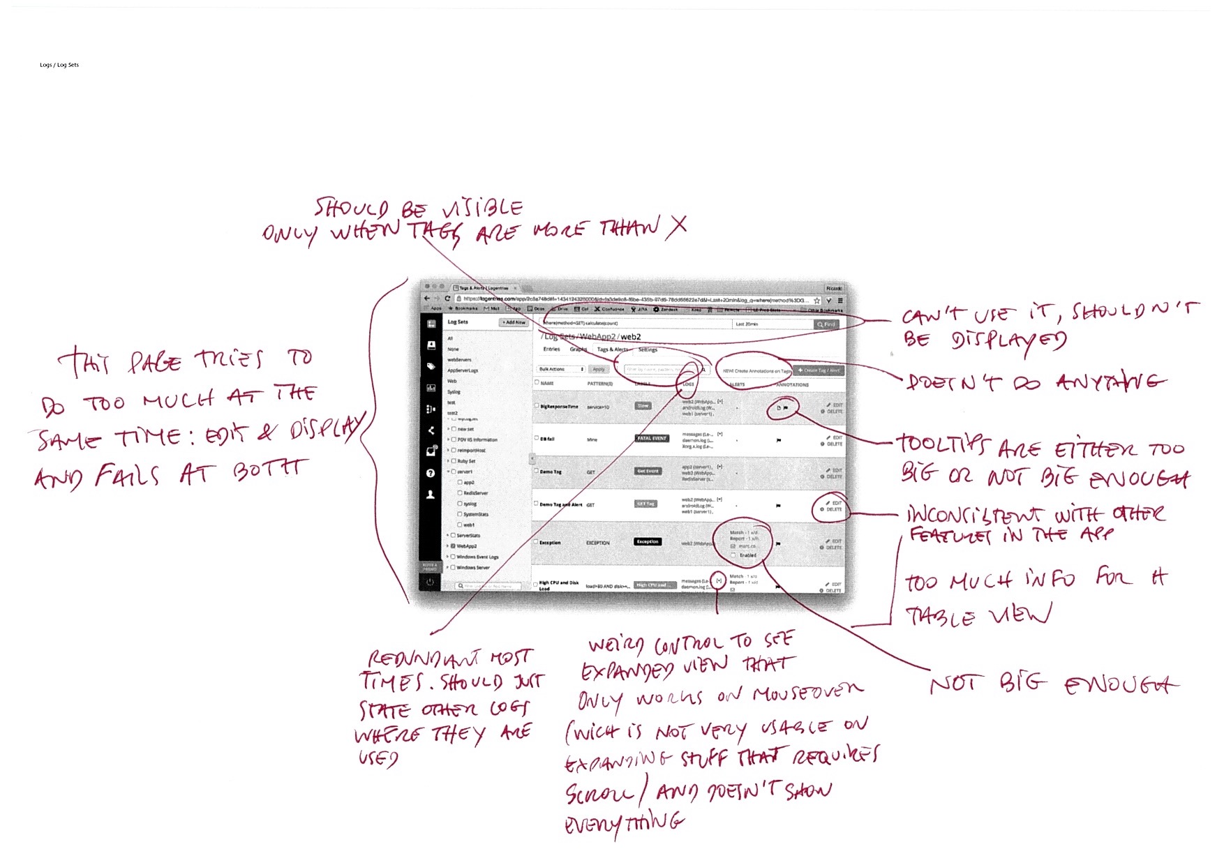
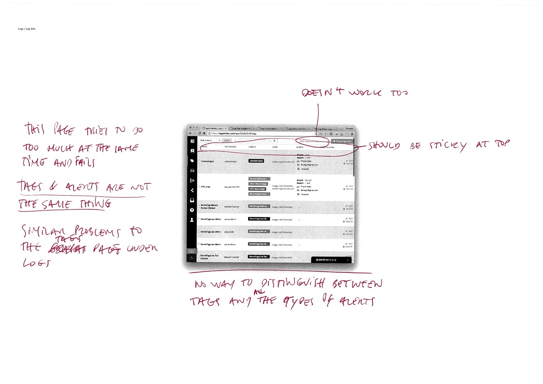
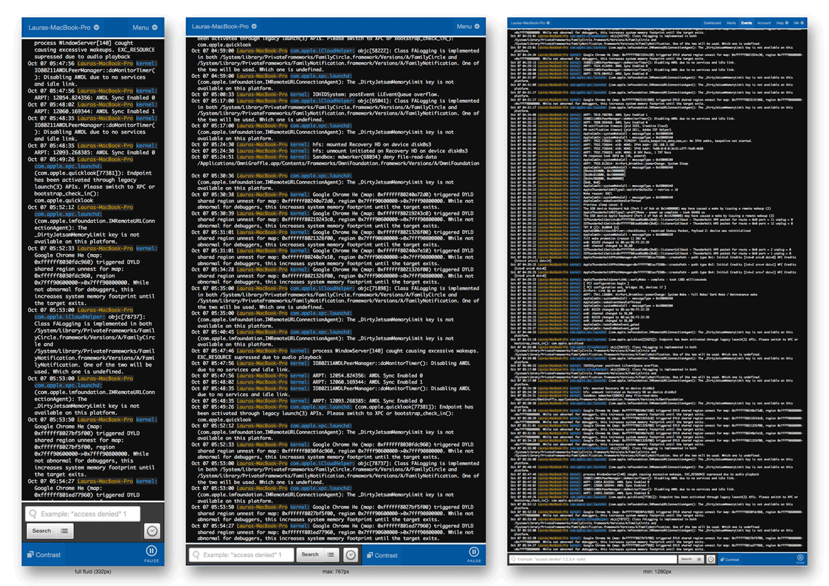
All users complained that there was not enough space to see data. Without text wrap, log lines bleed out of screen. With text wrap, it’s almost impossible to compare data.
We could simply address these problems individualy by adding more and better sorting & filtering tools, and maximise the log entries area but I couldn't help thinking that was probably the way how we got to this situation: by treating these as UI problems and addressing each one in isolation instead of seeking a holistic solution.
Discovery
Requirements gathering & stakeholder interviews
This project is easy. It's like riding a bike. Except the bike is on fire. And you're on fire, and the ground is on fire, and everything is on fire because you're in hell.
In order to fully understand the scope of the project, its constraints and potential needs, I interviewed the Head of Engineering, the System Architect, and a few key people that further explained the simple briefing I was given by the VP of Product:
- Support all log schemes
Users choose if they want to log one-to-one, one-to-many, many-to-one. - Support all customers
From the solo developer to the IBM sized organisations. - No changes to agents
Agents are applications users install on their servers to send their logs to LogEntries. - No changes to data format and composition
Data ingestion and tagging was like an assembly line, you can't stop or change it.
In a nutshell, the app was in a constant state of migration, used multiple technologies and frameworks in the backend, while each view was rendered using a mix of Angular, Python, and others.
The more I learned about the app's inner workings, about the multiple other attempts to fix or mitigate similar issues and their unsuccess, the more I was convinced that I wouldn't be able to change anything beyond cosmetics.
At this stage, this project was nothing more than a long list of constraints.
So when it came the time to set a direction for Research, I decided to focus on users as in my conversations with Marketing, Sales but mostly Support revealed that no one had ever asked them about their needs.
Discovery
Turning cooperation into collaboration
I had already built a solid relationship with the Support and Engineering teams, had formed an interesting partnership with the Sales reps, but hadn't had an opportunity to do so with every other department.
So I turned this into a multi-disciplinary effort, invited people in and asked them to take ownership of their area.
Empowering my colleagues, bringing them into the decision making process and incorporating their input, always making sure we’re putting the users first, was a refreshing experience for them and built an atmosphere of trust and transparency where everyone fully committed to the best of their abilities.


Some examples of one of my annotation sessions performed at a later stage
Discovery
Competitive Analysis
I leaned heavily on this project to tie up a lot of activities I'd plan to do (Personas, Competitive Analysis, etc) and a lot already underway (Shadowing, Usability Studies, Surveys, etc).
It was also the perfect ground to train the junior UI Designer, as it fit nicely the direction she wanted to grow as discussed in our 1:1s.
The first of such activities was a Competitive Analysis, where we started with a feature matrix and then documented the main flows in all declared media queries breakpoints.
This not only would show us how they were tackling any similar issues but gave us a sense of where were their customers, device and screen size wise.
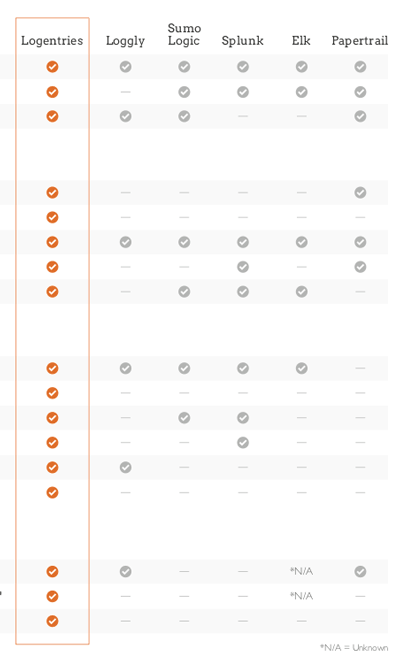
We learned that each company tackled these core features differently but generally they would divide between quantity vs quality and searching vs filtering.
Some had very distintive features like Papertrail above, who managed to have ~96% of their screen area devoted to log entries.
The diversity in approaches felt like they were targeting different audiences, something we couldn't confirm before knowing who they are and their needs, which brought us to users and activities.
Discovery
Users and Activities
Why users & activities instead of personas? Although we started with Personas in mind, research data showed 2 big groups of tasks spread across multiple job roles and areas. It didn't make sense at the time to model different personas.
Every year Logentries would survey their customer base and get a sense of who were these users and what they were using Logentries for. With the help of other departments, I've enriched that data with support tickets, user feedback, my own observations from customer calls, etc.
54% of users were Developers and/or DevOps.
94% of users used Logentries for Debugging/Troubleshooting.
68% of users used Logentries for Monitoring.
Months later we had enough granular data to turn these into the first draft of personas.
Discovery
Interviews & Ethnographic Studies
I've conducted multiple sets of interviews, using the insights of each set to tailor the next set of questions.
I've performed ethnographic studies like shadowing and contextual interviews, empathy building exercises like A Day In The Life, as well as whiteboarding sessions, tasks analysis, etc.
Through those we learned that users were not using the product as we thought they were and the difference was staggering.
In fact, everything we took for granted was wrong and we were far from actually fulfilling their needs.
Here are some of the most relevant quotes and insights from the user interviews:
- "A lot of monitor operations bring you into debug"
- "Give me small digestible chunks of information"
- "Let me do everything through the agent"
- "I need context!"
- "We need a faceted view of logs (think Amazon)"
- "Debug and monitor actions should be distinct"
-
"Monitor actions: actionable alerts + live tail + more alerts + friendly search.
Debug actions: search + tag + alert" - "The process of troubleshooting something is pretty much like googling a term you heard earlier and 4h later you’re on wikipedia reading about the Ottoman Empire. You go from discovery to discovery and they might not even be related."


One of the interviewees gave me what became the Vision for this project: the UI is for discovery.
It was clear that we would have to change the goals of the project to meet our users' needs.
Discovery
Redefined Goals
The insights collected during the user interviews became the backbone of our UX Strategy as they fit the Business Strategy and provide an initial path to Value Innovation.
I've rewriten the brief to incorporate them as our new project goals.
- UI is a gateway for discovery.
- Two (separate) modes: Debug and Monitor
- Clear, distinct tools and behaviours backed by an effortless switch
- Small, bite sized, chunks of relevant actionable information.
- Everything must be in context.
- Agents are the primary way to set up and collect data.
The UI is meant to support and not replace them. - To belong in the users’ toolkit, we need to support their unique case, and method of debugging / investigation, not dictate it.
- Support all customers and log schemes.
- No changes to agents nor data.
Concept Design
Sketches, visual thinking and training
The first part of the concept design stage was characterised by alternating between work sessions with collaborators, where we would typically query their knowledge, and ideation sessions where we'd use that information in whiteboard, sketch, mock up, etc exercises to further the junior UI Designer training.
One of these sessions types with collaborators was annotations, where I would ask my colleagues to help me annotate low quality prints of the app's interface, for example, or a particular flow.
Although these exercises are a simple way to start a conversation and break the ice, they quite often uncover connections and relationships that would be difficult to do collaboratively on a digital format.
Concept Design
Leveraging past work: panels
Some of the problems we were trying to solve had already been addressed before in previous projects so we tried to leverage past work as much as possible for consistency and speed.
One of those projects was Panels, where we brought into context the create and edit tasks and standardised their behavior.

Above: we designed a way to create and edit tags in context where existing forms load on slide-in panels.
Previous to this, users were forced to abandon their search, go to the tags page, and create a new or search to edit an existing tag.
If they had forgotten to copy their query, they would have to go back and start all over again.
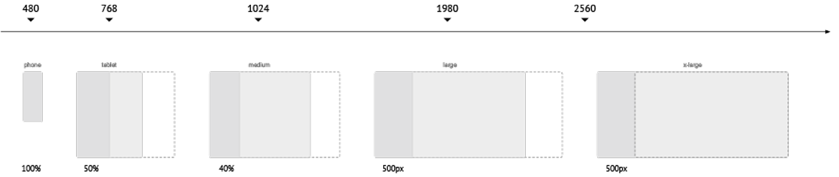
Above: diagram showing the panel widths across multiple screen sizes.
Most of our users were on the x-large and above end of the spectrum.
Concept Design
Leveraging past work: cards & flexbox
Cards were a new and popular pattern we'd recently introduced in Logentries. They were simple, lightweight, easy to create and implement as most of its complex behaviour was controlled by CSS rules.
Flexbox was being evaluated at the time after I had created the app with cards and flexbox to demo its capabilities and responsive behaviour.

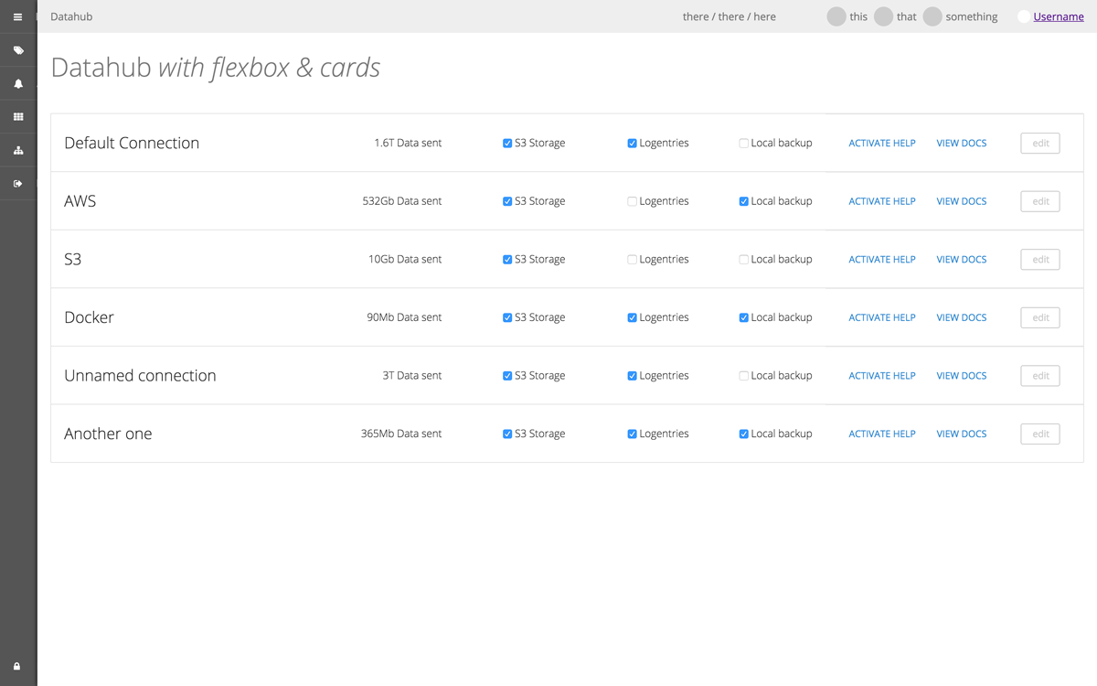
Above: screenshots of the fully responsive Dashboard and Datahub pages recreated using flexbox and cards.
Concept Design
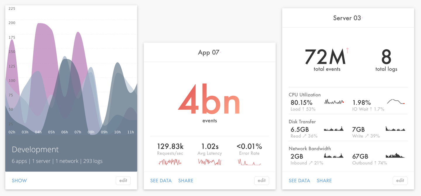
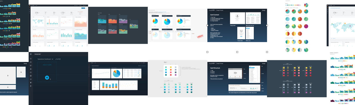
Leveraging past work: data visualisation
Data visualisation was one of the projects I started shortly after joining Logentries. There were multiple instances of data visualisation across the app that simply didn’t work, either because we chose the wrong chart format to display certain data (like using a treemap instead of a pie chart to display porportional data for example) or simply because we were trying to chart unstructured data, resulting in a broken visualisation.
My assumption was that colour, shape, and data points number and their format could communicate enough meaning at a glance. Many of our users would spend the entire day looking at dashboards and the cognitive overload of poorly crafted visualisations was massive.


Above: one of the earliest concept explorations with charts and dummy data.
Concept Design
Prototypes
Since so many of the existing parts were already complete or at advanced stages of development, I decided to skip any design mockups and go straight into prototyping to start validating my assumptions, starting with: does all this fit together?
I started working on a few different prototypes to test certain features individually which were then rolled up in a main prototype and later to a Proof of Concept.
Two separate modes
As I learned during the interviews, users were yearning for distinct debug and monitor modes. Although monitor is more passive in nature, driven typically by alerts, live tail, and search, it often leads users to debug, much more active and driven by search, tagging, and alert creation.
Since I wasn't able to get consensus regarding which actions should be in the menus, I tested with placeholders and simply asked users to imagine whatever they wanted to see on those menus.


Grid and List Views
As a way to support a true Monitor mode, I thought I could use the agent data to create smart cards that self-update and warn the user in case something is happening and separate that view from the live tail/search.
Although initially tied to the monitor / debug menu switcher, I ended up separating those functions and placing the control at the end of the second row, next to the sort controls.

Filters
The filters allowed users to build multidimensional queries using any combination of AND/OR logic within and between filter groups. Although the initial plan was to use only the side menu to drill down on data, it became obvious that you should be able to do that by either interacting directly with cards or with log entry data on the live tail or search results.
Smart cards
One of the first ideas tested was this concept of information clustering, where we'd use the agent data to divide and group log data based on their metadata, allowing us to show environments, apps and servers individually, and as entry points for deep exploration, i.e. clicking on an environment would hide the others and show only the cards of the apps and servers for that environment.
The cards included historical data and trends which were used to colour them with previously created schemes that combined good, bad, neutral, and standout colours.
Progressive enhancements
Progressive enhancements were considered for 2 cases in mind:
- Size of infrastructure: where you get additional features like search or tagging as your infrastructure grows beyond certain thresholds;
- Screen size: where the filter panel and layout changes based on the size of your infrastructure.

Concept Design
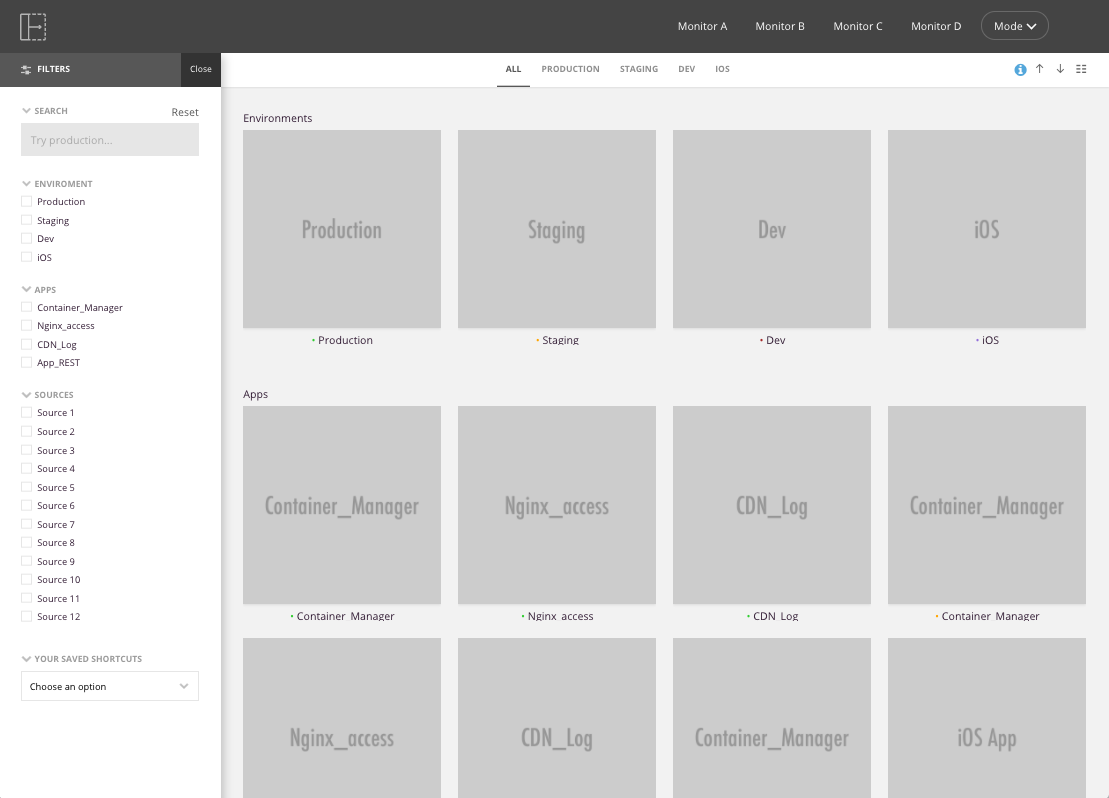
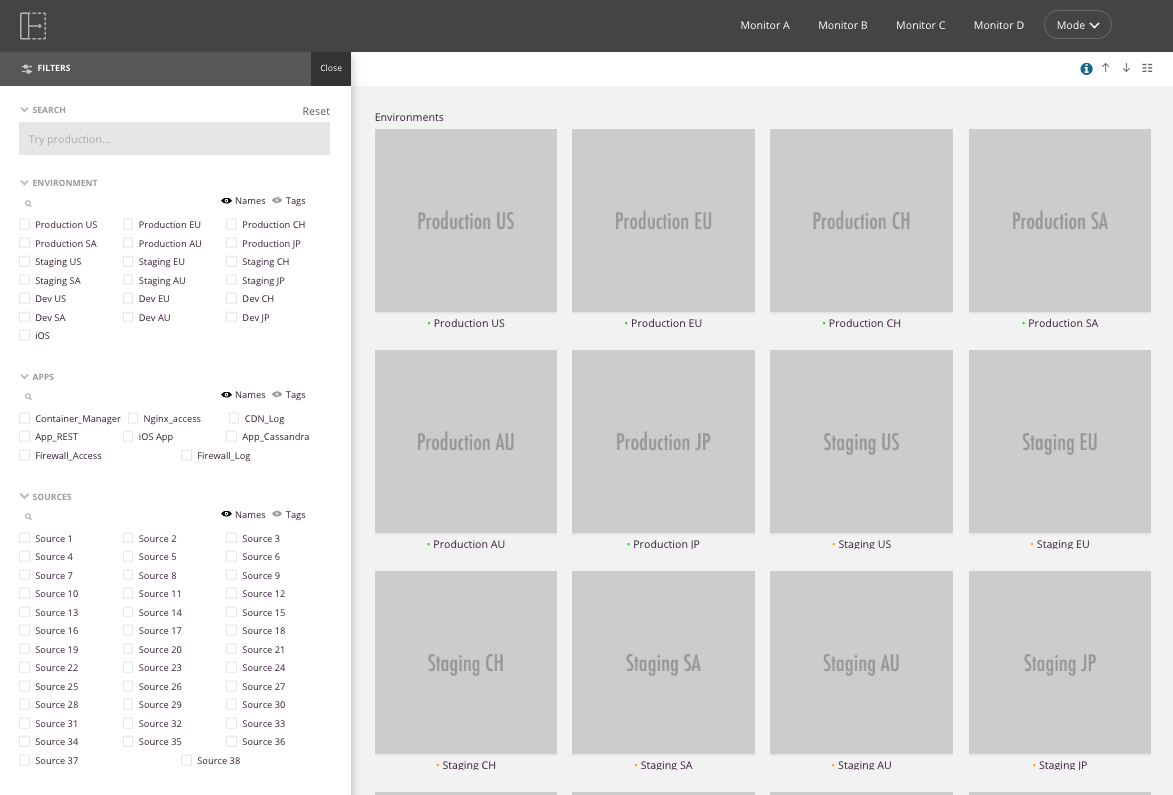
Proof of concept
With all prototypes tested and adjustments done, it was time to blend it all together in a semi working proof of concept prototype.
It shows 4 environments, where Production and iOS seem to have something wrong; 8 apps, where 3 (maybe the ones in iOS and Production) demand the user's attention and were moved to the top; and finally 8 servers/hosts where 2 seem to be extremely busy.
I've polished some aspects of the components and prototype but still consider this mid-fidelity as, again, the purpose was to validate the assumption that this worked all together.
Not visible in the video below but the prototype was responsive and those were some of the elements tested too.

Outcomes
Before the project was put on hold following the acquisition of Logentries by Rapid7, it was warmly welcomed by the project sponsor who pushed the goals even further.
A couple of months later I presented it with the Rapid7 UX team and it sparked multiple conversations about how this applies to their own products/services and audience. Cards and a few other components were quickly adopted and multiple colour and visual language projects were started with the goal of taking this a step further.
Technically it put Flexbox on every frontend engineer's radar and since then numerous components were shared between teams.
For me, it was the chance to built strong partnerships based on trust with my colleagues, show the value (and ROI) of a UCD approach and push the boundaries of my comfort zone a little bit further. It was also quite gratifying to be able to complete a project that seemed doomed from the start and deliver more value than what was initially expected.
Above: some of the multiple projects by the Rapid7 UX Team sparked by the Scalable UI.