As a Designer, your personal brand is the most challenging work you'll do.
Business Cards
The first version of my business cards was so bland and generic that I cried for the trees chopped down to print them. At the time, I saw them as obligatory objects to exchange when you meet people in a business context.
When it became clear that I was leaving the same bland and generic impression on those people, I began to design them with the dual purpose of conveying my personal brand statement and explaining what I did.
I started collecting feedback about how efficiently they were doing that and tweaking the message, tone and style.
Here are a few samples from iteration #4:
Fast forward a few years and iterations, hundreds of cards handed out, and tons of verbal and non-verbal feedback captured, I now have 19 different designs.
Here are a few samples from the latest version (as of 2019):
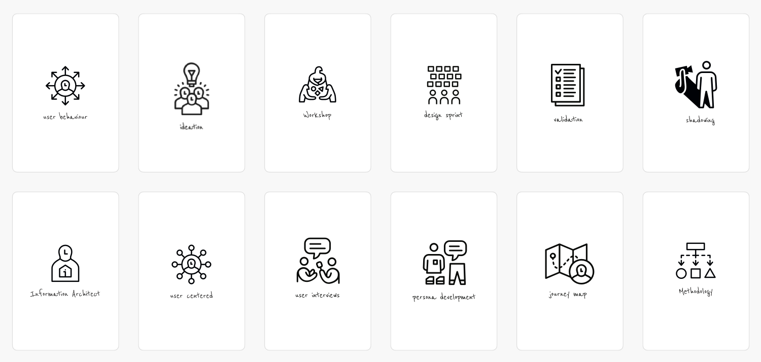
The purpose of having so many different business cards is to select the one you think will help that person remember you.
To give a real-life example: if I met someone and we ended up chatting about a problem they were having on their website/app about strategy, behavioural change, or user behaviour, I would give them that card. 9 out of 10 times, it leaves a lasting impression.
Outcomes
This has led to multiple business and employment opportunities. I'm approached regularly by people I've met briefly at a tech event/meetup who remember me because of my card(s). That's also frequently the story people tell when they refer me to a colleague or a prospective client.
Notebooks
When I was happy enough with the visual language and style I was using on my cards (i.e. getting consistent positive feedback about it) I decided to print my own notebooks.
Initially thought as a promotional tool, I quickly changed my mind and printed them exclusively for my own use.
After a few prototypes I settled on a dual system so I could use the same notebook for work and leisure just by reversing it. This means I'm always writing front-to-back and if I don't use that notebook for anything leisure, I can keep on writing work stuff.
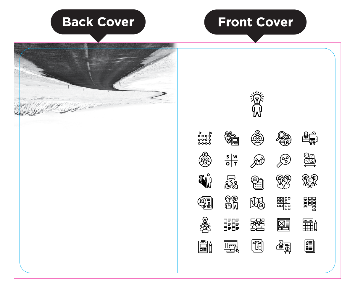
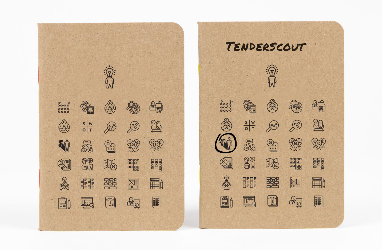
The front cover has multiple icons for typical UX activities including qualitative research, quantitative research, card sorting, diary studies, wireframes, etc, and enough space at the top to write a short title.
The idea was to circle or paint the activities covered in that notebook. Have a look at a side-by-side comparison between a blank and the one I've used In Tenderscout to take notes while I was shadowing the CEO to learn all about about tenders.
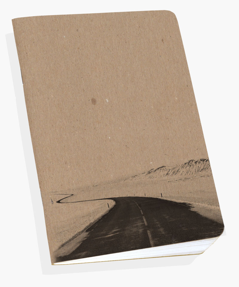
The back cover has a photo of an endless road that disappears over the horizon and plenty of space for a long title. I use it mostly to plan or write about my trips, as apparently I live in a permanent state of "urge for going".
